DASHBOARDS / Schnieder Electric Module Subscriptions

Schneider EcoStruxure — Subscription Complexity Made Legible

.NET

.NET

6

6

6

3

3

3

Azure

Azure

ECOSTRUCTURE

PLATFORM

DESIGN DECSIONS

REVERSED

DESIGN DECSIONS

REVERSED

DESIGN DECSIONS

REVERSED

STAKEHOLDER TEAMS

ALIGNED

STAKEHOLDER TEAMS

ALIGNED

CLOUD

INFRASTRUCTURE

KEY

DELIVERABLES

KEY

DELIVERBLES

CLIENT

CLIENT

CLIENT

ROLE

ROLE

ROLE

TEAM

TEAM

TOOLS

TOOLS

Schneider

Electric

Schneider

Electric

Schneider

Electric

Senior

UX Designer

Senior UX

Designer

Senior

UX Designer

UX, Product,

Engineering

UX, Product,

Engineering

UX, Product,

Engineering

Figma, Jira, Confluence

Figma, Jira,

Confluence

Figma, Jira,

Confluence

THE PROBLEM

EcoStruxure subscription activation was a black box. Complex dependencies, unclear states, no coherent management experience.

Staffing coordinators managing contacts across fragmented views with no unified relationship model — and no consistent way to track what mattered.

Schneider Electric's EcoStruxure platform had a subscription and activation model that had grown too complex for users to navigate confidently. Feature dependencies were invisible, activation logic was inconsistent across territories, and users had no reliable way to understand what they owned, what was active, or what was shared.

Madison Resources' Navigator CRM had grown organically — contact data was spread across disconnected views, relationship context was buried or missing, and coordinators were working around the system rather than through it. Data entry was inconsistent, relationship tracking was manual, and there was no clear information hierarchy to guide decision-making.

The goal was to design a unified contact relationship management experience inside Navigator — built on .NET Blazor and powered by the Gator Design System established earlier in the engagement.

THE CORE TENSION

No one knew what their organization had, what had expired, or how to get more.

Subscription modules were scattered with no central place to see what was active, what was shared, and what needed renewal. Purchasing and updating lived in different places. The system knew. The users didn't.

RESEARCH OUTPUT - USER PERSONAS

Personas built from direct customer research.

Tomo and William weren't defined upfront — they emerged from interviews and workflow observations with Schneider customers recruited through internal Schneider channels. I led recruitment coordination with the Schneider team to ensure we observed real activation and renewal moments, not recalled ones. Facilities managers and maintenance technicians observed directly as they subscribed to new modules and managed existing ones — giving product and engineering a shared customer model before any design decisions were made.

Tomo

FACILITY MANAGER

GOALS

Reduce carbon footprint and energy savings.

Improve response time across facilities.

Compliance monitoring throughout facility.

System configuration of compliance monitoring.

CHALLENGES

Technicians sharing subscription credentials

Difficult to find right channel for purchase and avtivation

NEEDS

Manage subscription usage

Keep subscriptions up-to-date

William

MAINTENANCE TECHNICIAN

GOALS

Keep equipment running smoothly through preventative maintenance.

Quicker triage time and greater accuracy.

Proactive maintenance schedule across all assets.

PAIN POINTS

Current subscription expiration dates not easy to find

Modules have no documentation on what they do

Difficult finding where to activate update modules

Handle a variety of new and changing technology.

NEEDS

Monitor real-time date using module packages

Use modules for state and federal compliance procedures

RESEARCH - DISCOVERY ARTIFACTS

Mapping the problem before designing the solution.

Five artifacts produced directly from customer interviews and workflow observation sessions with Schneider facilities managers and maintenance technicians.

How activation actually worked — drawn in the field.

Customers had to manually copy a Subscription ID from an email into a field inside EEO. No customer discovered this on their own — every participant required explicit guidance to complete the step.

KEY FINDINGS

Customers had to manually copy a Subscription ID from an email into a field inside EEO. No customer discovered this on their own — every participant required explicit guidance to complete the step.

How users discovered new modules — and where the flow broke.

The new module awareness flow mapped the front-end and back-end touchpoints from login through to activation. The map revealed that the notification trigger existed in the back-end but had no corresponding front-end action that users could follow without guidance.

KEY FINDINGS

Users received a "New Module" notification but had no clear path to act on it. Discovery and purchase were separated across systems with no unified flow connecting them.

The full activation journey mapped across every touchpoint.

The service blueprint documented user journeys, frontstage actions, and backstage system dependencies across the SE website, email messages, and the EEO platform. Three distinct user journey entry points mapped — each one revealing where users got lost or dropped off.

KEY FINDINGS

No single touchpoint owned the full activation experience. Users were expected to navigate between the SE website, email, and EEO with no handoff guidance between any of them.

Tomo purchases two bundles and activates them for the first time.

Process map showing what happens immediately after Tomo purchases Bundle A and Bundle B and logs into Mindt for the first time. A modal surfaces the subscriptions purchased — each bundle with its modules listed and an Activate button. A confirmation dialog asks Tomo to confirm before activating for the Mindt Choc account.

KEY FINDINGS

Even the simplest activation scenario — one user, one account, two bundles — required a confirmation step that no customer knew to expect. The mechanism (modal vs inline) was still an open question during research.

Tomo switches accounts — Bundle A already activated, Bundle B available for a new account.

The same subscriptions purchased modal, but now Tomo is logged into the BurgerKing account. Bundle A shows as already activated for Mindt — greyed out. Bundle B can be activated for the Burger King account. A new Activation ID is generated. This is the multi-account complexity that was completely invisible in the existing UI and the root cause of most activation failures observed in research.

KEY FINDINGS

Customers managing multiple accounts had no way to see which bundles were already activated, for which account, or whether a new activation was possible. Every multi-account customer encountered this as a failure — not a feature.

DESIGN - ITERATIONS

Five iterations. Each one shaped by research.

Every design iteration started from a specific finding from customer interviews and workflow observations. I reviewed iteration outcomes with product and engineering at each stage — research-influenced improvements called out explicitly so decisions were traceable, not assumed. Nothing moved forward without team alignment on what changed and why.

Designing for retention — module management, subscription status, and utilization visible at a glance.

GOALS IN MIND

  1. Increase retention and subscriptions.

  2. Shortcuts and ease of navigation.

  3. Module management features.

  4. Subscription updates and module status.

  5. Billing notifications.

  6. Visible module capabilities and information.

RESEARCH INFLUENCED

Modules tab redesigned with activation shortcut, tenant assignment, and utilization column. "Follow the blue badges" CTA pattern introduced to drive module exploration from within the platform.

CHANGE 1

Activation shortcut added to the modules list — users no longer need to navigate away to activate.

CHANGE 2

Upgrades button added as a shortcut to the upgrades tab directly from the nav bar.

CHANGE 3

Module utilization column introduced — maps to time spent in each module to surface low-engagement risk.

CHANGE 4

Subscription & Billing notification badge added to surface billing alerts without interrupting workflow.

Designing for retention — module management, subscription status, and utilization visible at a glance.

GOALS IN MIND

Subscription updates and module status.

RESEARCH INFLUENCED

Customer interviews revealed that Schneider customers were unaware of what modules were available for their subscriptions, what those modules did, and what value they provided. Newly released modules badge introduced — any interaction resets the NEW badge and chip color in the tab. Applicability estimate added based on historical use analysis.

CHANGE 1

Newly released modules badge — resets on interaction to drive discovery without persistent noise.

CHANGE 2

Applicability estimate — shows how applicable additional modules would be based on historical use.

CHANGE 3

CTA to explore new modules linked directly to specific module pages on Exchange.

CHANGE 4

System compatibility scan added — surfaces whether the user's system can support a module before purchase.

Giving users a clear, downloadable record of every subscription and module purchase.

GOALS IN MIND

  1. Increase retention and subscriptions.

  2. Shortcuts and ease of navigation.

  3. Module management features.

  4. Subscription updates and module status.

  5. Billing notifications.

  6. Visible module capabilities and information.

RESEARCH INFLUENCED

Customer interviews revealed accounts were shared across large organizations and user management was difficult. Customers observed during workflow sessions had no visibility into what modules they owned or what they were entitled to. Billing tab redesigned as an invoice history with order number, plan type, date, and price — all filterable and downloadable.

CHANGE 1

Invoice history table replaces the basic billing view — full purchase record per line item.

CHANGE 2

DSC seamless account flag added — if EO account, seamless account is included automatically.

CHANGE 3

Recent additions confirmation — users can confirm recent purchases without navigating away.

CHANGE 4

View/Download PDF action added — users can export invoice records for compliance and accounting.

Full subscription context — installed modules, available upgrades, and module detail expandable in one view.

GOALS IN MIND

  1. Increase retention and subscription

  2. Shortcuts and ease of navigation

  3. Module management features

  4. Visible module capabilities and information

RESEARCH INFLUENCED

Users needed to understand what was installed, what was locked, and what was available — in one place. Expandable module rows introduced so users can read full module descriptions without navigating away. Available modules surfaced below installed modules with pricing.

CHANGE 1

Explore Products CTA links directly to Exchange/Shop tab from within the subscriptions view.

CHANGE 2

Upgrade button is a shortcut to the Transaction (Exchange) page — reduces navigation steps.

CHANGE 3

Manage button links to My Digital Library (Seamless) page for full asset management.

CHANGE 4

Expandable module rows — users can read full module descriptions inline without leaving the view.

Color-coded module types and AutoSort — making the module list scannable at a glance.

GOALS IN MIND

  1. Increase retention and subscriptions

  2. Shortcuts and ease of navigation

  3. Module management features

  4. Visible module capabilities and information

RESEARCH INFLUENCED

GoDigital Modules were not seamless — users had to continue workflow in a new UI. Color-coded module types introduced to differentiate module categories visually. AutoSort added to order the list according to practice priority.

CHANGE 1

Color-coded module type indicators — each category has a distinct color so users can scan by type.

CHANGE 2

Explore Modules CTA updated — links to Exchange/Shop tab with correct routing context.

CHANGE 3

AutoSort added — list ordered automatically according to practice priorities, not entry order

CHANGE 4

GoDigital module continuity resolved — module workflow stays within EEO rather than launching a new UI.

MY ROLE

Led UX research and design for EcoStruxure subscription management — from activation mapping through wireframes and final UI.

WHAT I OWNED

Full scope — activation complexity mapping, subscription purchase logic, workflow dependency visualization, card-sort research, wireframes, development alignment, and final UI design for the subscription management interface.

HOW I WORKED

EcoStruxure runs on .NET Framework and Azure IoT infrastructure — the SmartConnector middleware layer handles subscription logic and feature activation in C# and .NET. I worked directly with engineering to understand how the backend model surfaced in the UI, so design specs accounted for real activation behavior, not assumed behavior. That alignment prevented logic gaps between design and build.

THE CONSTRAINT

Subscription features had hidden dependencies — one activation could silently affect others. The UI had to surface that complexity without overwhelming the user.

"The most valuable deliverable wasn't the UI — it was the activation logic map. Once everyone could see the full model, the right design decisions became obvious."

OUTCOMES

A legible subscription management experience — built on a fully mapped activation model and validated against real user needs.

Full activation model documented — the first complete map of EcoStruxure's subscription logic, shared across design, product, and engineering as a single source of truth. Decisions that previously required back-and-forth with engineering could be made directly from the model.

Clear subscription visibility interface — users could see what they owned, what was active, and what was shared without needing to understand the underlying .NET activation logic. Subscription confusion eliminated at the point of interaction, reducing support burden and renewal friction.

PROJECT GALLERY

From activation complexity mapping to legible subscription UI

Subscription Activation

ID Entry Modal

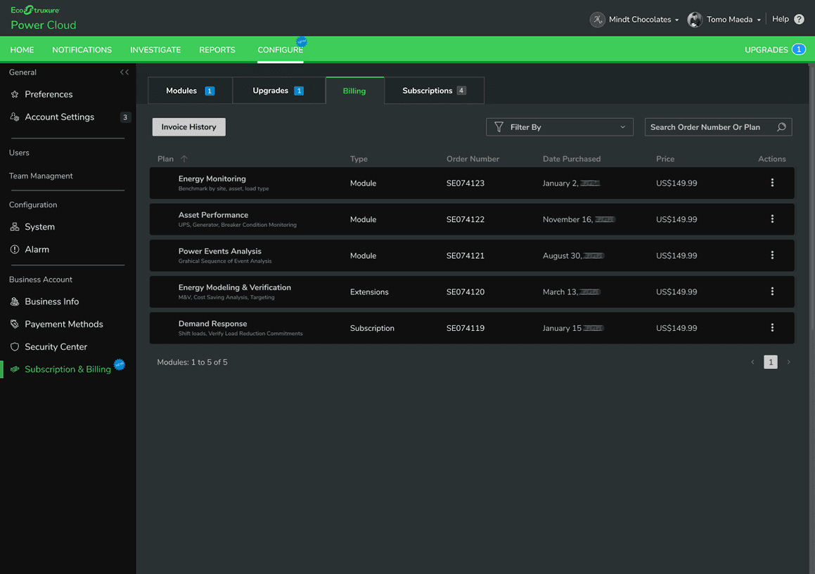
Billing Tab Invoice History & Order Tracking

Modules Tab Status, Expiration & Utilization at a Glance

Final UI — Modules Tab with Activation State

Final UI — Upgrades Tab & Module Marketplace

Final UI — Billing Tab with Invoice History

What I'd do differently

Run the card interviews before completing the activation logic map. Mapping the technical model first was necessary for credibility, but the research revealed users had different mental models for concepts I'd already designed around. Running both in parallel would have let user language shape the map from the start.