BLAZOR / Madison Resources CRM Gator Design System


One Shared Foundation for Three Fragmented Codebases


THE PROBLEM
A CRM that had outgrown itself — three frameworks, no shared design logic, and a UI held together by ad-hoc styling.
Navigator had grown across React, Angular, and .NET Blazor with no shared design logic. Every team built their own components, their own patterns, their own workarounds. Delivery slowed. Rework compounded. Three teams solving the same problems three different ways — and none of it transferable.

UX DEBT SPIRAL — HOW AD-HOC STYLING DECISIONS COMPOUND ACROSS THREE FRAMEWORKS
THE SYSTEM
One shared foundation to replace three diverging ones.
A design system isn't just a component library. It's the infrastructure that lets teams build consistently without coordinating constantly — shared language, shared tokens, shared decisions that don't have to be made twice.

WHAT WE BUILT — THE FIVE PILLARS OF THE SHARED DESIGN FOUNDATION
THE CORE TENSION
Three teams, three frameworks, zero shared foundation. Every new feature added more drift.
Without a shared token layer, each team solved styling problems independently. Every new feature became a new opportunity for inconsistency. The longer it went unaddressed, the more it cost.
MY ROLE
Led the end-to-end creation of Gator — Madison's first unified design system — partnering across Product, Engineering, and three product teams.
WHAT I OWNED
Full system — UI audit, atomic component architecture, token structure, Figma variants, multi-framework implementation guidance, and governance rollout across CRM, Payroll, and Onboarding.
HOW I WORKED
Three active frameworks — React, Angular, and .NET Blazor — had to consume the same design tokens and component patterns without a full rewrite. The system had to work within existing constraints, not replace them.
THE CONSTRAINT
Drove audits, component architecture, accessibility alignment, and implementation guidance — ensuring the system was both scalable for teams and trustworthy for developers from day one.
PROCESS
Seven phases — from audit and benchmarking to governance and adoption across three product teams.
From audit to adoption — across CRM, Payroll, and Onboarding.
UI Audit & Stakeholder Alignment
Audited every screen across three frameworks to map the full scope of UI drift before proposing anything.
Comparative System Benchmarking
Evaluated Material, Salesforce Lightning, and internal tools to define what 'good' looked like for this system.
Atomic Architecture Definition
Defined the component hierarchy, token structure, and naming conventions the whole system would build from.
Component Design & Figma Variants
Built every component with full variant sets — states, sizes, themes — implementation-ready from day one.
Theme & Token Development
Established the CSS token layer that fed React, Angular, and .NET Blazor simultaneously without framework-specific overrides.
Multi-Framework Implementation Guidance
Paired with engineering to validate components in all three frameworks — no 'designed in Figma, broken in Blazor' surprises.
Governance, Rollout & Adoption Support
Built the contribution model and documentation that let three product teams adopt the system without slowing down.
TOKEN ARCHITECTURE
One token layer three frameworks
One token layer consumed identically by React, Angular, and .NET Blazor — no per-team overrides, no drift, no dependency conflicts.
CRM AUDIT & DRIFT REMEDIATION
A mountain of debt mapped and resolved
A full audit surfaced every inconsistency across Navigator's UI. The findings gave engineering a sequenced remediation roadmap — decisions backed by evidence, not opinion.

UI AUDIT PRIORITIZATION — DEBT MAPPED AND SEQUENCED BY IMPACT AND EFFORT ACROSS NAVIGATOR
ANGULAR'S TOKEN ECOSYSTEM
Angular Material was already built for this
Angular Material is built on a token-first architecture semantic tokens, density tokens, typography scales, component-level overrides. That alignment is why Angular consumed Gator's token layer with no friction. Designing to Angular's model first meant Blazor and React could consume the same tokens — a future-proof architecture rather than a lowest-common-denominator one.
RESEARCH & DISCOVERY
What three product teams actually told us.
Three teams, three frameworks, zero shared design logic. What we heard made the problem clear — the drift wasn't accidental. It had been accumulating for years with nothing to stop it.
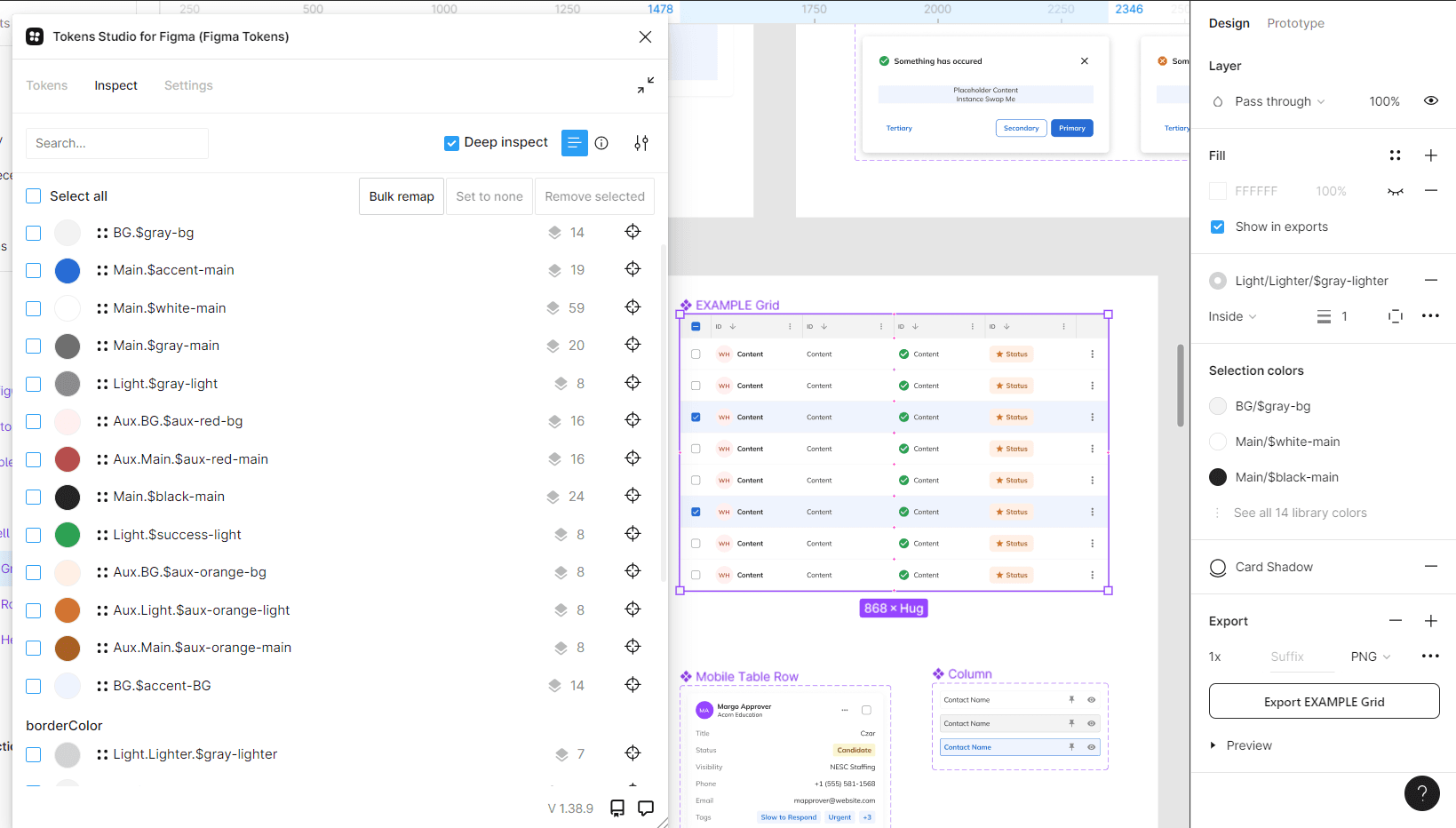
TOKEN STUDIO INSPECTION — DESIGN TOKENS AUDITED ACROSS COMPONENTS AND FRAMEWORKS IN FIGMA
Heard Directly
Product Teams
❝
Heard Directly
Engineering
❝
"We built our own components because nothing existed that worked across our stack."
Each team had independently solved the same problems — buttons, inputs, grids, modals — in isolation. React, Angular, and .NET Blazor had each accumulated their own component libraries. None of them talked to each other, and none of them were consistent.
"Every new feature adds more drift. There's no shared source of truth to build from."
Without a shared token architecture or component library, every new feature became a new opportunity for inconsistency. Engineers were making ad-hoc styling decisions because there was no governed alternative — and those decisions compounded with every release.
Heard Directly
Designers
❝
Heard Directly
Product Leadership
❝
"I design it in Figma and it breaks in Blazor. Every time."
The handoff gap between design and .NET Blazor implementation was systemic. Figma components had no direct relationship to Blazor component capabilities. Designers were discovering constraints after delivery — not before — and rebuilding work as a result.
"We can't coordinate across teams if every team is speaking a different design language."
Cross-team product decisions were slowed by the absence of shared vocabulary. What one team called a card, another called a tile. What one team had solved for modal states, another was still figuring out. Coordination required translation at every touchpoint.
Four teams, four different versions of the same problem. That alignment across stakeholders became the mandate for every architectural decision that followed.
CORE TENSION
Every user story shipped with custom code. No shared foundation meant every feature was built from scratch.
STAKEHOLDERS WANTED
Faster delivery
Consistent UI across products
Scalable across teams
Predictable timelines
ENGINEERS
NEEDED
One token layer, not three
No custom code per story
Clear contribution model
DESIGN RESOLVED
Atomic system all frameworks consumed identically
Mobile-first, desktop-ready
Governance rollout with adoption support
The Resolution
Developers weren't moving slowly because they lacked skill. They were rebuilding the same components repeatedly because nothing governed existed to build from.
RESEARCH - DESIGN
Every decision traced back to a finding.
One token layer, three frameworks — the decision that made everything else possible.

ATOMIC FOUNDATION — TOKENS, TOGGLES, CHECKBOXES, AND ICONS AS THE BASE LAYER OF THE SYSTEM
A token layer wasn't just a technical convenience — it was the only architecture that could unify three frameworks without requiring a rewrite. One change to a token would propagate across every surface simultaneously.
Audit before architecture — mapping the debt before proposing anything.

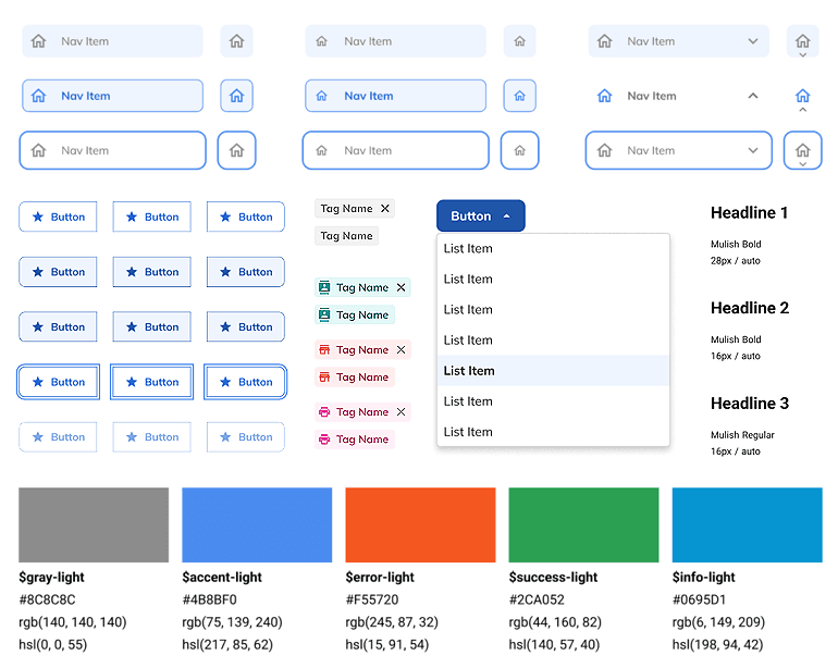
COMPONENT INVENTORY — Button and tab variants documented across frameworks. Inconsistencies like these were catalogued across every screen before architecture began.
Proposing an architecture before mapping the full scope of drift would have produced a system designed around assumptions. The audit made every decision defensible.
Designing to Angular's model first — making React and Blazor follow.

ORGANISMS — Modal panels and data grid rows composed from the atomic component hierarchy.
Angular Material was already built on a token-first architecture. React and Blazor had no equivalent foundation — every styling decision was made ad-hoc.
Designing to Angular's model wasn't a compromise — it was the smartest available foundation. A system built to Angular's token structure meant React and Blazor could consume the same layer without a lowest-common-denominator approach.
Angular Material's semantic tokens, density tokens, and typography scales became the architectural reference. React and Blazor were mapped to consume the same token layer — future-proof by design, not by accident.
Implementation-ready specs — closing the "designed in Figma, broken in Blazor" gap.

PAGES — Full CRM contact view assembled from the complete Gator component hierarchy.
Designers were discovering Blazor constraints after delivery — not before. Every mismatch between Figma and Blazor landed back on the design side to resolve, slowing every sprint.
A component library is only as good as its implementation guidance. Figma variants without Blazor binding specs were incomplete deliverables — not handoff-ready.
Every component delivered with Blazor parameter bindings, state definitions, and responsive behavior documented. Paired with engineering to validate in all three frameworks before release — no surprises at handoff, no rework after.
"The hardest part wasn't building the system — it was designing it to work inside three frameworks simultaneously without asking teams to stop shipping."
OUTCOMES
A scalable, governed foundation delivered in weeks — adopted across three product teams.
3
4
Component adoption across CRM, Payroll, and Onboarding — one governed system replaced three independent component libraries.
Increased engineering trust and consistency —developers built against a documented foundation instead of resolving styling conflicts case by case.
Coordinator relearning eliminated — consistent layouts and behaviors across every Navigator module from day one.
Three frameworks unified without a rewrite — React, Angular, and .NET Blazor consuming identical tokens and patterns simultaneously.
PROJECT GALLERY
From fragmented codebases to one shared design foundation


Components
Components
Token Settings
Page Components
Page Templates
Color System
What I'd do differently
Start with the question I now ask in every engagement: how mature is your design system? Watching styling debt compound week after week across three frameworks made that lesson permanent. The cleanup was constant, milestones were slipping, and the dev team wasn't at a senior level — which meant every inconsistency landed on the design side to resolve. I'd surface the foundation gap in discovery, before the first component is built.