MOBILE / Chentronics Flame Sensor


Chentronics' first mobile product,
designed for expert technicians I never got to meet.
THE PROBLEM
Chentronics needed a diagnostic app for the field technicians who used the iScan® 3+ and still ran their checks by hand. Manual checks produced inconsistent logs, followed no guided process, and left no record of what was found in the field. For a product launching to industrial customers, that inconsistency was a liability and a support cost.
Available now on the Apple App Store and Google Play, or download direct from Chentronics download at:
chentronics.com [ ↗ ]

Industrial IoT
Hardware Diagnostics
Real-Time Monitoring
Data Visualization
Mobile (iOS + Android)
OVERVIEW
iScan Live put a guided flame-sensor diagnostic in the technician's pocket, the first mobile product Chentronics shipped, built and launched on a single .NET MAUI codebase across iOS and Android.
Chentronics needed a diagnostic app for field technicians as the iScan® 3+ launch approached. Manual checks created inconsistent logs, ran with no guided process, and left no record of what was found in the field. For a product launching to industrial customers, that inconsistency was a liability and a support cost.
Available now on the Apple App Store and Google Play, or download direct from Chentronics download at:
PROBLEM & BUSINESS CONTEXT
A mobile diagnostic for technicians who already knew how to read the hardware.
Technicians diagnosed flame sensors by feel and years of experience, so the app's job was to put the hardware's signal in their pocket without getting in the way. The three design decisions that followed shared one starting point: the technicians already knew the hardware, and the app had to honor that.
CONSTRAINTS I NAVIGATED
No direct user access
First-of-its-kind product with no existing behavior to observe. The user was reached through the project manager and a structured read of the competition.
One codebase, two platforms
A single .NET MAUI front end had to carry the full signal experience across iOS and Android, with no per-platform divergence.
Field conditions
Glove use, outdoor glare, and single-hand reach at the burner front, designed in from the first screen rather than retrofitted.
MY ROLE
The technician's voice reached me through the project manager and the competitive landscape.
Chentronics had never shipped a mobile product, and the technicians who would use iScan Live had never held a tool like it. Discovery ran on two tracks: the project manager carried the user's voice as a proxy, working the field teams directly, and a structured read of Forney Pro and Forney HD Connect set the bar the app had to clear.
What I Owned
End-to-end UX for iScan Live: research synthesis, the fault-state taxonomy, every Figma frame, the interaction design, and the specs the .NET MAUI and backend teams built from. Engineering and I aligned on the .NET MAUI front end and .NET backend before component work began, then I stayed in through integration so the shipped behavior matched the design.
What the project manager surfaced
• Live signal plots and safe-distance Bluetooth were the baseline technicians would arrive expecting.
• Configuration was a separate, gated job in every tool reviewed.
• The prevailing way to show tuning was a screen of raw numbers a Chentronics technician should not have to wade through.
Service-design lens: a service view, not just a screen view.
iScan Live is one touchpoint in a technician's service, alongside the iScan® 3+ hardware, the phone in the field, and the desktop tool at the bench. The work mapped the technician's first visit to a plant as a journey: sync the fleet, monitor by default, configure only when needed. Designing the handoffs across that journey, not just the screens, is what kept the app continuous with the tools the technician already used.
RESEARCH & DISCOVERY
The technician's voice reached me through the project manager and the competitive landscape.
Chentronics had never shipped a mobile product, and the technicians who would use iScan Live had never held a tool like it, so there was no workflow to observe. Discovery ran on two tracks, neither needing me at a burner front. The project manager worked the field teams directly and carried the user's voice, so across the engagement he served as the proxy for the technician: every requirement traced to something he relayed from the field rather than something assumed at the desk.
The project manager carried the user's voice. He worked with these field teams directly, so across the engagement I treated him as the proxy for the technician, drawing out how sensors got diagnosed today, what slowed the work down, and what a phone would be expected to do alongside the hardware. Every requirement traced to something he relayed from the field rather than something I assumed at the desk.
What the project manager surfaced:
Live signal plots and safe-distance Bluetooth were the baseline technicians would arrive expecting.
Configuration was a separate, gated job in every tool reviewed.
The prevailing way to show tuning was a screen of raw numbers a Chentronics technician should not have to wade through.
Why this matters:
Direct user interviews were not available on a first-of-its-kind product. Reaching the user through a stakeholder proxy and a structured read of the competition is how the research got done, and it is the approach I reach for whenever the users sit behind a client, a clearance, or a product that does not exist yet.

Forney's Pro app, studied screen by screen. Tuning, frequency windows, gain, relay thresholds, and a Change Password field, all sits behind authorization. This is the configuration depth iScan Live kept out of the everyday field view.
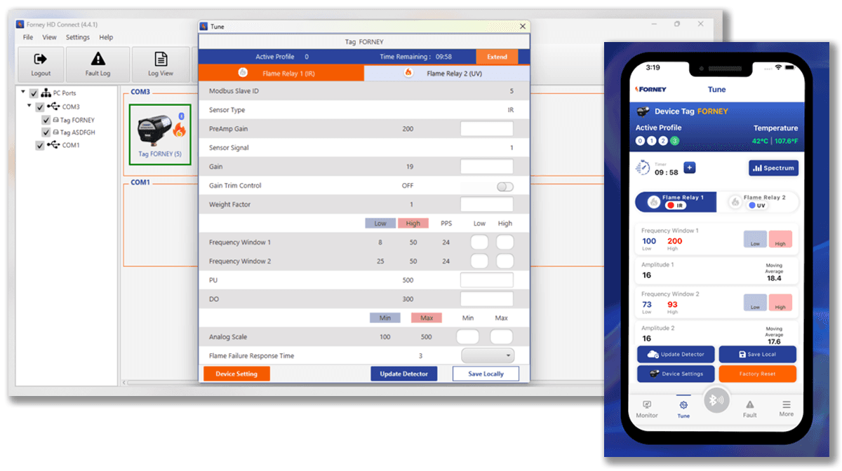
Forney runs on the desktop too. Forney HD Connect mirrors the mobile app and manages several devices across COM ports, so the category spanned phone and PC. That range set the bar iScan Live had to clear.

Monitoring and the live frequency spectrum, on desktop and on the phone. Reading the signal was the shared baseline across the category, the part iScan Live had to match before improving on anything.
FINAL SOLUTION
A simple screen in the field that still carries the full hardware story.
The design held two needs together rather than trading one off: the simple phone experience a technician reads in seconds, and the full fault-state depth the iScan 3+ can report. The resolution was a hardware-aware flow that identifies the device first, then shows only the states and steps that apply.
KEY FEATURE 1
Speak the technician's existing visual language


Hardware lighting signals translated to the app interface
FINDING
Technicians already read flame health off the iScan 3+ itself, through the Ring of Light and the signal readout on the hardware. Forney, by contrast, surfaced tuning as a wall of numeric parameters: frequency windows, gain, amplitude, relay thresholds.
INSIGHT
The phone should not ask the technician to learn a new representation. It should mirror the cues they already trusted on the device, so reading the app felt like reading the scanner.
DESIGN
The Ring of Light from the hardware shows up as the colored ring in the app, with the live frequency plot beside it. The technician reads the phone the way they read the scanner, and the dense numeric detail stays out of the everyday view.

The iScan® 3+ and its Ring of Light, the hardware cue the app brings to the phone.
KEY FEATURE 2
Built for field conditions before desk conditions.


High-contrast black and white across every screen, sized to read at the burner front, from equipment grouping to live monitoring to device discovery.
FINDING
The work happens at the burner front, in poor light, often with gloves on and one hand occupied. A screen that reads well on a desk can fail there.
INSIGHT
Field ergonomics were a requirement, not a polish pass. Target size, contrast, and reach had to hold up in the conditions the technician actually works in.
DESIGN
High-contrast black and white as the default, so every screen stays legible in outdoor glare, with large targets and single-hand reach built in from the first screen rather than retrofitted.
KEY FEATURE 3
Structured around the real visit: sync the fleet first, monitor by default, configure on purpose.

The fleet, grouped by turbine and listed by connection state, with a tap into any connected scanner's live flame signal.
FINDING
A plant runs a scanner on every turbine, and a first visit means syncing all of them before any monitoring can begin. The competitive analysis showed the category drew a hard line at configuration: Forney's five-tab app puts monitoring in the open and locks the Tune tab behind a password, and its tuning screens are dense walls of numeric fields.
INSIGHT
Pairing was the technician's first real job on site, not a setup chore to bury, so the device list had to be a first-class surface. Configuration deserved the category's separation without its friction, and iScan Live did not need a password wall or a screen of raw numbers to keep a live scanner safe from a mistaken tap.
DESIGN
The app works from a device list grouped by equipment, so a first-visit tech can pair and sync every turbine's scanner in one place. Tapping a connected scanner opens straight onto its live flame signal, plotted in real time with the AC and DC readout beside it, while configuration stays behind its own entry in the tab bar rather than in the monitoring view.
DESIGN SYSTEM
Brand and fault-state colors kept separate from day one.
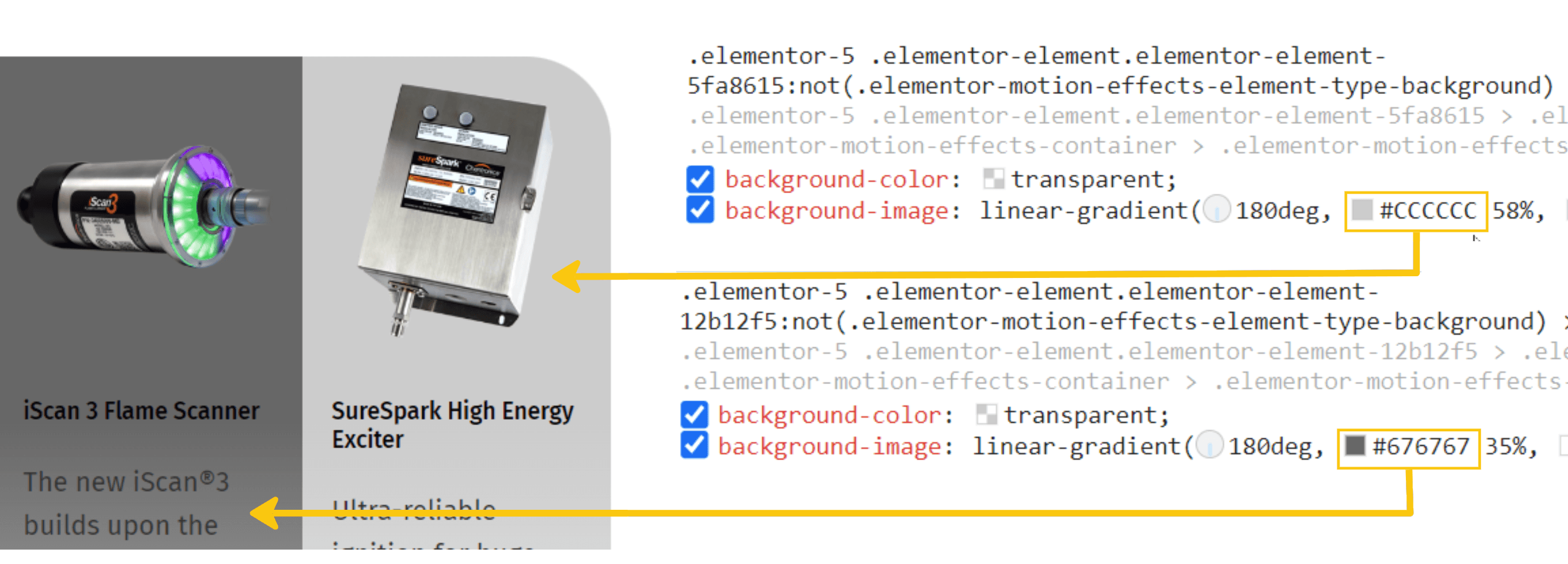
Chentronics' primary brand color is orange, which collides with warning and alert states at full saturation. Tinted versions of the brand palette created separation, so orange could read as a brand signal without being mistaken for a hardware fault. The alert states, green, magenta, blue, yellow, and red, mapped to real hardware conditions and stayed visually clear of the brand at every level.

Two palettes held apart: brand orange and its tints, and the chart and alert colors, each tied to a hardware condition like flicker signal, plot line, or device light, so the brand never reads as a fault.

The iScan Live component library: Fira Sans and Fjalla One, with cards, buttons, tabs, and an icon family built for the hardware's vocabulary.
PROTOTYPE
From sensor signal to guided repair, built to run on more than one surface.
In React Native, the technician journey was designed end to end, from Bluetooth device discovery through the live monitoring surface.
Available now on the Apple App Store and Google Play, or download direct from
Chentronics download at:
"The technicians had a working relationship with the iScan. The design's job was to extend that relationship onto a phone, not introduce a new vocabulary."
DELIVERABLES
The mockups got them moving. The taxonomy kept them aligned.
Annotated Figma mockups for every screen and state, plus the fault-state taxonomy as a shared data contract: each fault code mapped to a severity, a color token, and a plain-language action, structured so the React Native front end and the .NET backend read from the same source rather than each inventing their own. The guidance lived with the data.

The Chentronics file built for handoff: every screen and state in one place, marked ready for development, opened in Dev Mode so engineering could read layout and color variables straight from the design.
OUTCOMES
A working mobile product, live in app stores, built to extend the trust technicians already had.
First mobile app for Chentronics
A hardware company's first move into mobile, live in the App Store and Google Play.
A guided flow where there was none
Diagnostics that ran on individual experience now follow a consistent, device-aware path.
Visual language extended to the phone
The Ring of Light technicians read on the hardware now reads the same way in their hand.
Foundation in place for desktop
A React Native front end that can extend toward a desktop tool without a rebuild.
PROJECT GALLERY
From hardware signal research to shipped diagnostic app


Desktop App Research
Branding Research
Information Architecture


Technician Workflows
Sensor Configuration
Feedback Loop


Data Visualization Iteration 1
Data Visualization Iteration 2
Wireframe Iteration


Iteration 1
Iteration 2
Iteration 3


Final Designs
Final Designs
Final Designs
What I'd do differently
Next time, the push is for direct access to technicians. On a first-of-its-kind product there was no existing behavior to observe, and the project manager carried the user's voice well enough to ship, but a few field conversations would have validated the fault-state language faster than relaying it back and forth. Reaching users through a stakeholder proxy and a structured competitive read is a real method, and it is the one to reach for when direct access is closed. The change would be to treat it as the floor and fight for the field visit on top of it.