Case Studies / Insurance Underwriting Dashboard
Case Studies / Insurance Underwriting Dashboard
Case Studies / Insurance Underwriting Dashboard
Unified Underwriting Experience
Unified Underwriting Experience
Unified Underwriting Experience
30% Faster Decisions With a Unified, Real‑Time Workflow
30% Faster Decisions With a Unified, Real‑Time Workflow
Read time: 6–7 minutes

General Star’s underwriting teams were slowed by scattered tools, inconsistent layouts, and manual lookups that broke focus. I led the design of their first unified underwriting dashboard for the GENESIS G2 intranet streamlining workflows, embedding reusable Material components, and establishing a governed system that scaled across teams and frameworks.
GenStar Insurance’s underwriting teams were slowed by fragmented tools, inconsistent UI patterns, and manual processes that created friction at every step.
As Principal UX/UI Designer, I designed the first unified underwriting dashboard for the GENESIS G2 intranet streamlining workflows, embedding reusable Google Material components, and establishing governance that scaled across teams and frameworks.
Client / General Star
Client / General Star
Role / General Star Insurance
Category / Insurance
Category / Insurance
Tools / Figma, Jira, Confluence
Team / UX, Product, Engineering
Team / UX, Product, Engineering
Team / UX, Product, Engineering
Platform / React with custom Google Material design system
Platform / React with custom Blazor design system
Platform / React with custom Blazor design system
Outcome Summary
User Experience Improvements
User Experience Improvements
User Experience Improvements
• Faster decisions with clearer, more focused workflows
• Real‑time signals surfaced without leaving the screen
• Less cognitive load from fewer lookups and cleaner hierarchy
Faster decisions with cleaner, more focused workflows
Real-time signals surfaced without leaving the screen
Less cognitive load from fewer lookups and cleaner hierarchy
Engineering Alignment
Engineering Alignment
Engineering Alignment
• LED parity
• Bluetooth behavior
• Real‑time data modeling
• Cross‑platform consistency (.NET MAUI)
• Shared component names and standards kept design and dev in sync
• Implementation‑ready specs reduced back‑and‑forth and rework
• Scalable patterns made new screens easier to build and maintain
Business Value
Business Value
Business Value
More consistent decisions through unified tools and patterns
Lower long‑term overhead with a modular, governed system
A clearer foundation for future real‑time features and expansion
Before → What wasn't working
Understanding the problem
Underwriters were working across outdated tools, Excel sheets, and disconnected screens. Key signals weather, market shifts were buried or missing entirely. The result was slow decisions, inconsistent reviews, and high cognitive load.
Underwriters were working across outdated tools, Excel sheets, and disconnected screens. Key signals weather, market shifts were buried or missing entirely. The result was slow decisions, inconsistent reviews, and high cognitive load.
What was found
Data scattered across slow, legacy tools
No single dashboard to anchor the underwriting workflow
Layouts and patterns inconsistent across React, Angular, and AG Grid
Manual lookups for weather, market activity, and exposure context
Why it mattered
Slower intake and review decisions
Higher chance of missing critical details
Operational risk from inconsistent workflow
Impact (After)
A shared baseline for redesign priorities: real‑time context, unified hierarchy, and predictable patterns across the underwriting workflow.
Before → Discovery Insights
We ran stakeholder interviews, workflow reviews, and a comparative audit across Adobe, Payfactors, Zoho, and internal tools. Adobe became the primary benchmark for clarity and density.
We ran stakeholder interviews, workflow reviews, and a comparative audit across Adobe, Payfactors, Zoho, and internal tools. Adobe became the primary benchmark for clarity and density.
What underwriters an stakeholders told us
What underwriters an stakeholders told us
“Seasonal patterns matter, freeze warnings, heat waves, hurricane season. I need that context at the moment I’m evaluating the account.”
“Seasonal patterns matter, freeze warnings, heat waves, hurricane season. I need that context at the moment I’m evaluating the account.”
“Seasonal patterns matter, freeze warnings, heat waves, hurricane season. I need that context at the moment I’m evaluating the account.”
“If a company’s stock drops 10% in a day, that’s a signal something’s going on financially. I need to factor that in.”
“If a company’s stock drops 10% in a day, that’s a signal something’s going on financially. I need to factor that in.”
“If a company’s stock drops 10% in a day, that’s a signal something’s going on financially. I need to factor that in.”
“The systems are so old and clunky that by the time you find what you need, you’ve already lost your train of thought.”
“The systems are so old and clunky that by the time you find what you need, you’ve already lost your train of thought.”
“The systems are so old and clunky that by the time you find what you need, you’ve already lost your train of thought.”
“The systems are so old and clunky that by the time you find what you need, you’ve already lost your train of thought.”
“The systems are so old and clunky that by the time you find what you need, you’ve already lost your train of thought.”
“The systems are so old and clunky that by the time you find what you need, you’ve already lost your train of thought.”
“We’re leaving money on the table because critical context is buried. By the time someone pieces everything together, the opportunity has already moved on.”
“We’re leaving money on the table because critical context is buried. By the time someone pieces everything together, the opportunity has already moved on.”
“We’re leaving money on the table because critical context is buried. By the time someone pieces everything together, the opportunity has already moved on.”
Comparative Audit discovery


What This Clarified
• The dashboard needed real‑time context, not static summaries
• Dense data required clean hierarchy and predictable patterns
• Navigation needed to be anchored, consistent, and scalable
• Engineering needed shared components and naming to reduce rework
What this clarified
The dashboard needed real‑time context, not static summaries
Dense data required clean hierarchy and predictable patterns
Navigation needed to be anchored, consistent, and scalable
Engineering needed shared components and naming to reduce rework
Design Strategy→ The goal was simple: create a unified, governed workspace that reduced friction, improved clarity, and gave underwriters the signals they needed without leaving the screen.
Design Strategy→ The goal was simple: create a unified, governed workspace that reduced friction, improved clarity, and gave underwriters the signals they needed without leaving the screen.
During → Branding & Font System Decisions
The Underwriting Dashboard needed a consistent visual system, but no brand guidelines or design documentation existed. I pulled colors, typography, and layout patterns directly from the public website to establish a provisional base. Barlow was retained for general UI continuity, and Roboto was introduced for AG Grid to provide the monospaced clarity needed for dense, tabular data.
The Underwriting Dashboard needed a consistent visual system, but no brand guidelines or design documentation existed. I pulled colors, typography, and layout patterns directly from the public website to establish a provisional base.
Barlow was retained for general UI continuity, and Roboto was introduced for AG Grid to provide the monospaced clarity needed for dense, tabular data.
What was delivered
• Extracted font sizes, weights, and color codes from the public site
• Built a provisional design system for dashboard use
• Retained Barlow for general UI consistency
• Introduced Roboto for AG Grid and tabular components
• Documented font usage by component type and interaction pattern
What was delivered
Enabled consistent visual language across the dashboard despite lack of brand support
Improved data legibility and alignment in grid-based components
Created a scalable foundation for future design system formalization
Impact (After)
Enabled consistent visual language across the dashboard despite lack of brand support
Improved data legibility and alignment in grid-based components
Created a scalable foundation for future design system formalization

Impact (After)
Enabled consistent visual language across the dashboard despite lack of brand support
Improved data legibility and alignment in grid-based components
Created a scalable foundation for future design system formalization
During → Material Aligned Theme & Component System
To eliminate styling drift across React, Angular, and AG Grid, I built a custom Material theme with tokenized color, spacing, and typography. This included a full set of reusable components buttons, inputs, selects, tabs, and table patterns all built in Figma with developer‑ready specs.
To eliminate styling drift across React, Angular, and AG Grid, I built a custom Material theme with tokenized color, spacing, and typography. This included a full set of reusable components buttons, inputs, selects, tabs, and table patterns all built in Figma with developer‑ready specs.
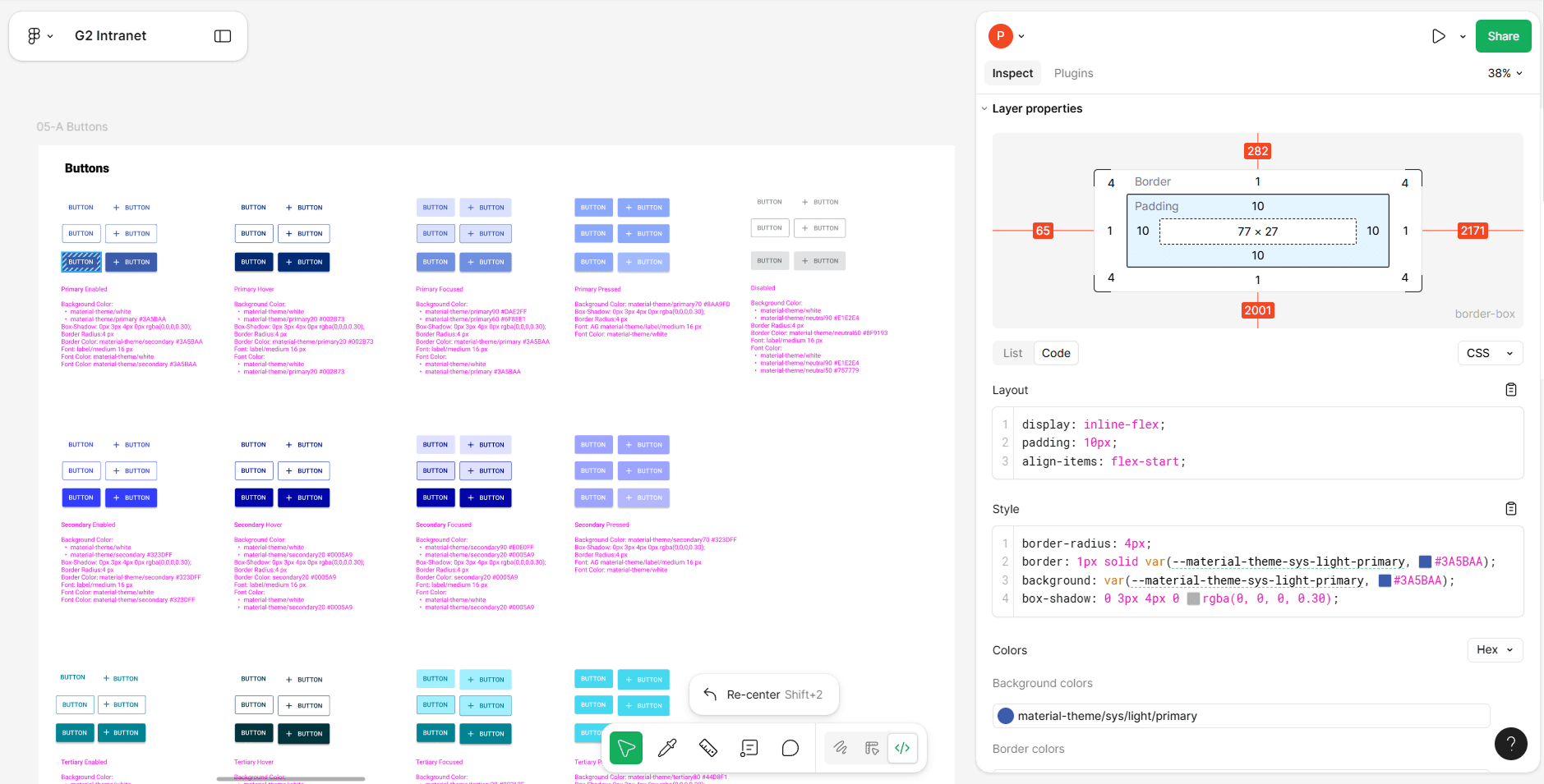
What was delivered
• Custom Material components (buttons, inputs, selects, tabs, alerts, chips)
• Figma components aligned to Material and AG Grid behavior
• Token‑based system for color, spacing, and type
• Unified styling across React, Angular, and AG Grid
• Clear rules, edge cases, and reuse logic
What was found
Styling gaps created friction for both underwriters and engineering
AG Grid default styling caused visual drift and layout inconsistencies
Impact
• Cleaner, more predictable UI across the entire workspace
• Faster engineering delivery with fewer questions and less rework
• A scalable foundation for future features
Why was designed
Figma components aligned to Material patterns
Token-based system for color, spacing, and typography
Unified styling across Material UI and AG Grid
Impact (After)
Faster engineering delivery with fewer questions and less rework
Cleaner, more predictable UI across the entire workspace
A scalable foundation for future features
Why it mattered
Inconsistent components slowed task flow and increased cognitive load
Engineering teams faced repeated rework to maintain parity across frameworks
Impact (After)
Faster engineering delivery with fewer questions and less rework
Cleaner, more predictable UI across the entire workspace
A scalable foundation for future features
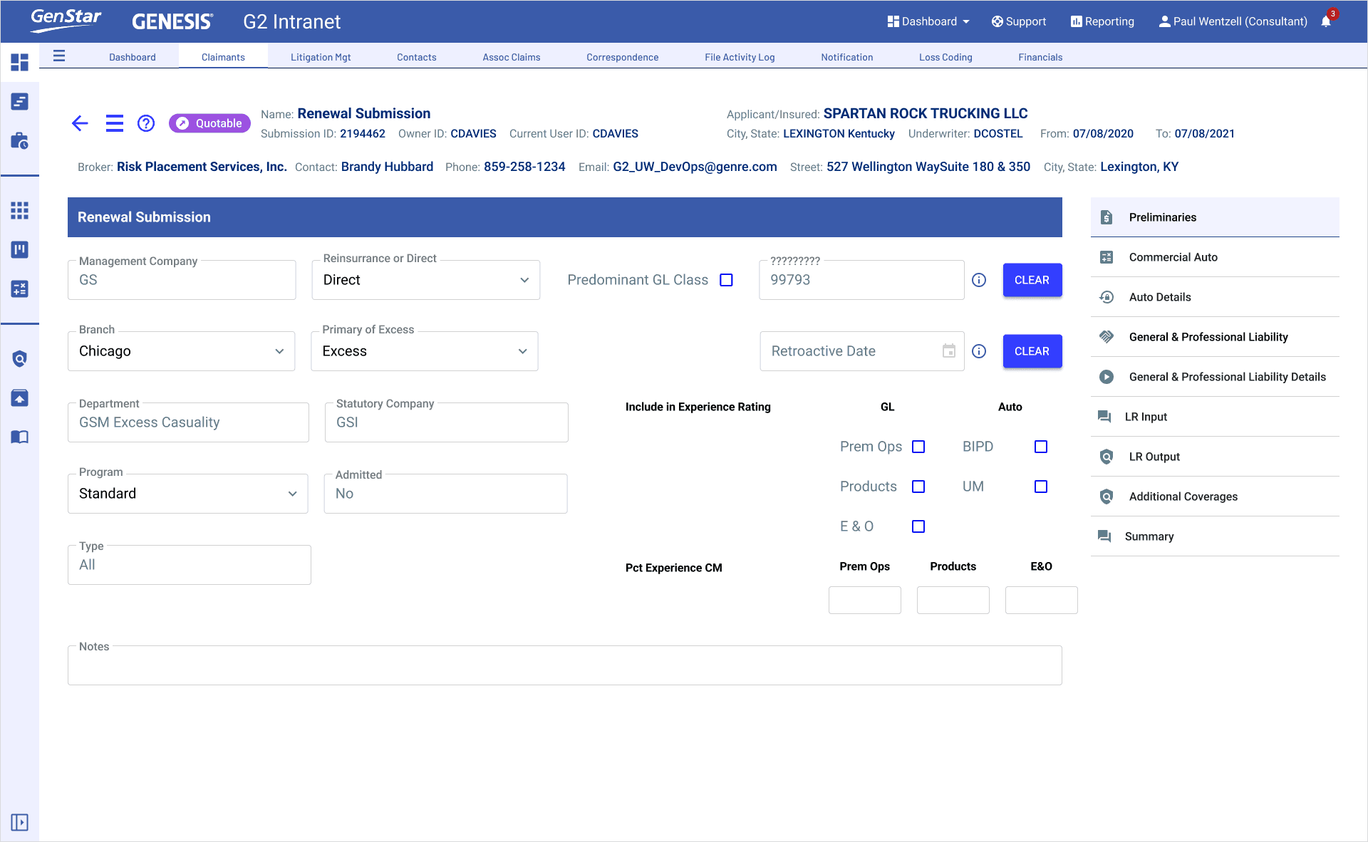
During → Clarifying Dense Underwriting Data
The Underwriting Dashboard needed a consistent visual system, but no brand guidelines or design documentation existed. I pulled colors, typography, and layout patterns directly from the public website to establish a provisional base.
Barlow was retained for general UI continuity, and Roboto was introduced for AG Grid to provide the monospaced clarity needed for dense, tabular data.
What was delivered
Enabled consistent visual language across the dashboard despite lack of brand support
Improved data legibility and alignment in grid-based components
Created a scalable foundation for future design system formalization
Impact (After)
Enabled consistent visual language across the dashboard despite lack of brand support
Improved data legibility and alignment in grid-based components
Created a scalable foundation for future design system formalization
Impact (After)
Enabled consistent visual language across the dashboard despite lack of brand support
Improved data legibility and alignment in grid-based components
Created a scalable foundation for future design system formalization
During → Clarifying Dense Underwriting Data
Low‑fidelity mockups were refined to clarify dense data views and establish consistent patterns across the underwriting workflow. The animated sequence highlighted layout improvements, hierarchy adjustments, and unified styling across Material UI.


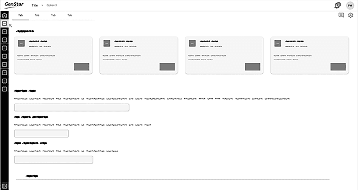
What improved
• Clearer hierarchy for dense tables
• Predictable layouts across frameworks
• Faster scanning of risk details and exceptions
Impact (After)
Underwriters could evaluate submissions without hunting for information, and teams shared a consistent mental model for complex data.
During → Clarifying Dense Underwriting Data
Low‑fidelity mockups were refined to clarify dense data views and establish consistent patterns across the underwriting workflow. The animated sequence highlighted layout improvements, hierarchy adjustments, and unified styling across Material UI.
Low‑fidelity mockups were refined to clarify dense data views and establish consistent patterns across the underwriting workflow. The animated sequence highlighted layout improvements, hierarchy adjustments, and unified styling across Material UI.
What improved
• Clearer hierarchy for dense tables
• Predictable layouts across frameworks
• Faster scanning of risk details and exceptions
What improved
• Clearer hierarchy for dense tables
• Predictable layouts across frameworks
• Faster scanning of risk details and exceptions
Impact (After)
Underwriters could evaluate submissions without hunting for information, and teams shared a consistent mental model for complex data.
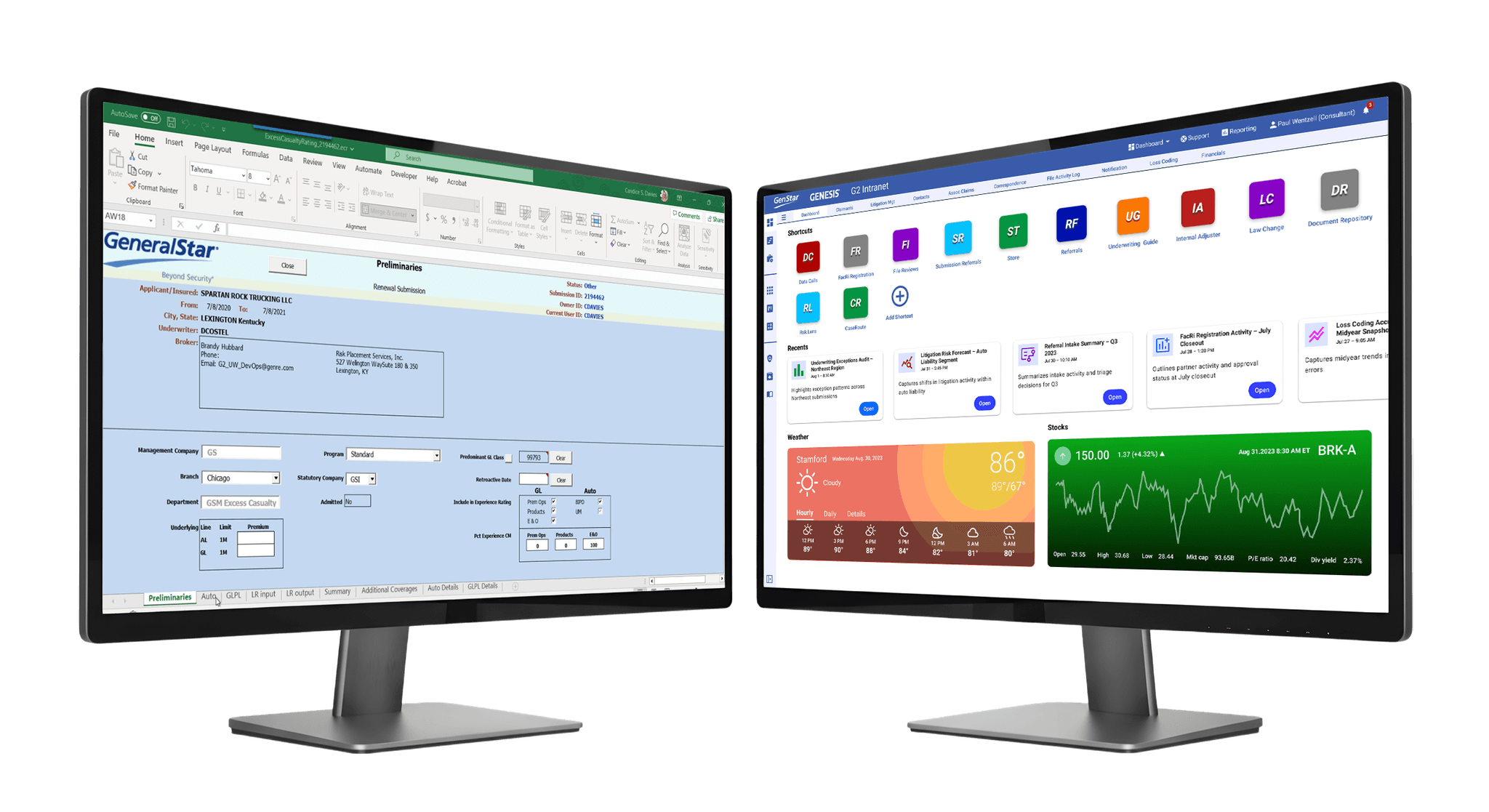
During → Real-Time Weather & Stock Widgets
We introduced lightweight React components using NOAA and financial APIs. Surfacing real‑time data was straightforward — the real value came from embedding it directly into underwriting workflows.
Introducing Lightweight React components using NOAA and financial APIs. Surfacing real‑time data was straightforward — the real value came from embedding it directly into underwriting workflows.


What was designed
Weather widgets using NOAA‑streamed conditions
Stock widgets with visual indicators for market changes
Scalable vector components styled with Google Material fonts
What was designed
Weather widgets using NOAA‑streamed conditions
Stock widgets with visual indicators for market changes
Scalable vector components styled with Google Material fonts
Impact (After)
• No more external lookups
• Faster, more confident decisions
• A governed model for future real‑time components
Impact (After)
• No more external lookups
• Faster, more confident decisions
• A governed model for future real‑time components
After → A Unified Underwriting Workspace
The redesigned underwriting dashboard consolidated fragmented tools into a single, governed workspace that improved clarity, reduced cognitive load, and accelerated underwriting decisions. While the project did not include final production screens, the design documentation itself established the patterns, components, and interaction rules that now guide implementation across the GENESIS G2 platform.
The redesigned underwriting dashboard consolidated fragmented tools into a single, governed workspace that improved clarity, reduced cognitive load, and accelerated underwriting decisions. While the project did not include final production screens, the design documentation itself established the patterns, components, and interaction rules that now guide implementation across the GENESIS G2 platform.


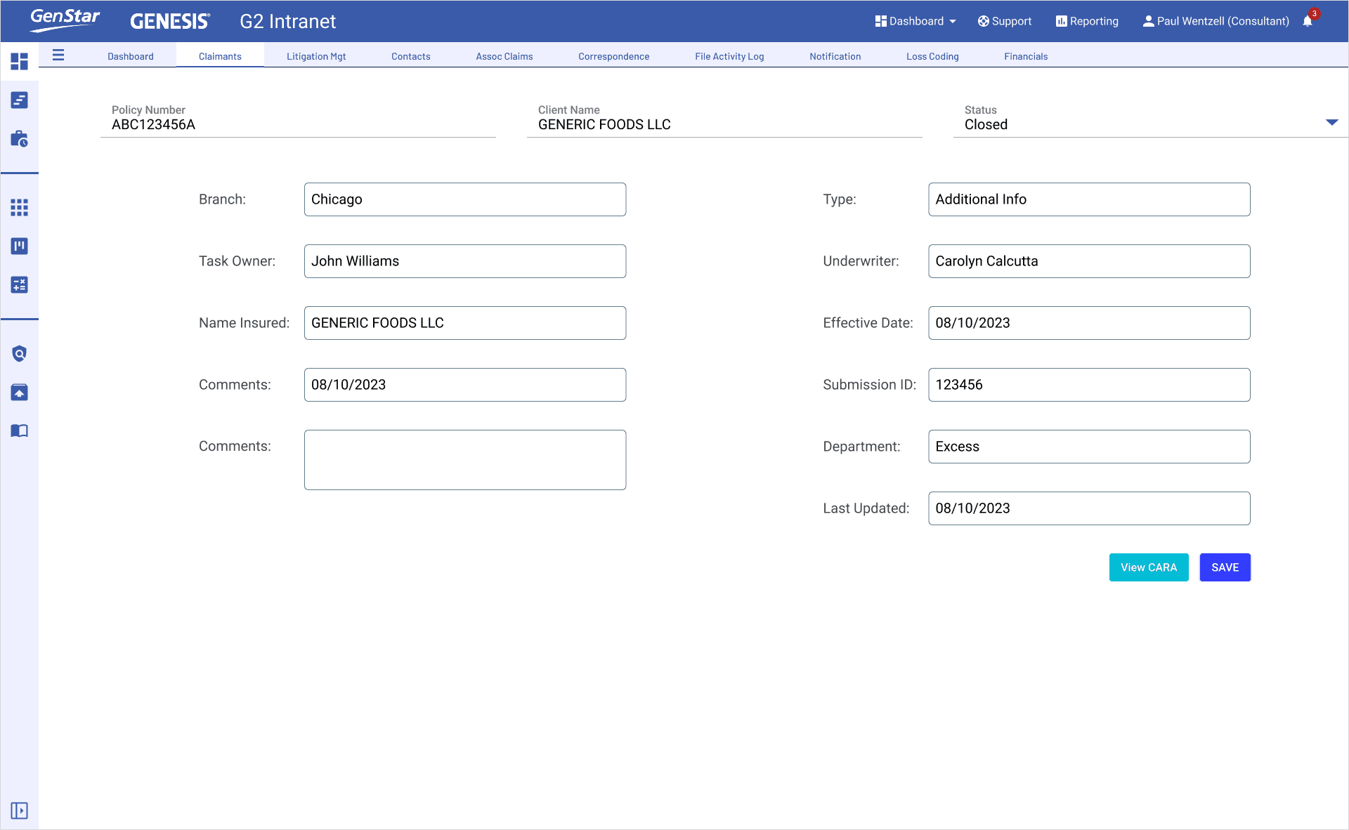
What the system demonstrates
• Real‑time weather and market signals surfaced directly in‑workflow
• Consistent layouts across React, Angular, and AG Grid
• Clear hierarchy for risk tiers, exceptions, and scoring
• Predictable grid behavior and scanning patterns
• Reusable Material‑aligned components for future expansion
• Tokenized theme ensuring accessibility and cross‑framework consistency
What the system demonstrates
• Real‑time weather and market signals surfaced directly in‑workflow
• Consistent layouts across React, Angular, and AG Grid
• Clear hierarchy for risk tiers, exceptions, and scoring
• Predictable grid behavior and scanning patterns
• Reusable Material‑a ligned components for future expansion
• Tokenized theme ensuring accessibility and cross‑framework consistency
Why it mattered • Underwriters made faster, more confident decisions
Engineering delivered features with less rework
Leadership gained a scalable model for future modernization
The organization aligned ar ound a single, governed design system
Why it mattered
Underwriters made faster, more confident decisions
Engineering delivered features with less rework
Leadership gained a scalable model for future modernization
The organization aligned ar ound a single, governed design system
What the system demonstrates
Real‑time weather and market signals surfaced directly in‑workflow
Consistent layouts across React, Angular, and AG Grid
Clear hierarchy for risk tiers, exceptions, and scoring
Predictable grid behavior and scanning patterns
Reusable Material‑a ligned components for future expansion
Tokenized theme ensuring accessibility and cross‑framework consistency
Why it mattered
• Underwriters made faster, more confident decisions
Engineering delivered features with less rework
Leadership gained a scalable model for future modernization
The organization aligned ar ound a single, governed design system
Impact (After)
A unified underwriting workspace that improved decision speed, reduced operational risk, and established a long‑term design foundation for General Star’s GENESIS G2 platform.
Impact (After)
A unified underwriting workspace that improved decision speed, reduced operational risk, and established a long‑term design foundation for General Star’s GENESIS G2 platform.
Other Projects

Flame
Sensor

Gator Design
System

Underwriting
Dashboard
Flame Sensor
Gator Design System
Financial Trading
Flame
Sensor
Gator Design
System
Financial
Dashboard
AI Assistant
Virtual Paul