Case Studies / Flame Sensor
Case Studies / Flame Sensor
Case Studies / Flame Sensor
Mobile Diagnostics Platform
Mobile Diagnostics Platform
Mobile Diagnostics Platform
Mobile‑first diagnostics built on LED parity, technician workflows, and real‑time IoT visibility
Mobile‑first diagnostics built on LED parity, technician workflows, and real‑time IoT visibility
Read time: 7–9 minutes

iPhone Focus → This case study emphasizes the iPhone experience, showcasing design system clarity and technician workflows, while Android delivery was achieved in parallel.
Chentronics, a leader in industrial flame detection, needed a mobile application to support technicians in the field. With the iScan®3+ launch approaching and competitors already offering mobile tools, the absence of a mobile diagnostic experience created operational risk, competitive pressure, and workflow friction
I designed and delivered a cross‑platform mobile system that gives technicians real‑time visibility into flame signals, LED states, and device health — directly on‑site, without relying on desktop tools.
Client / Chentronics
Client / Chentronics
Client/ Chentronics
Category / IoT Connected Sensors
Category / IoT Connected Sensors
Category/ IoT Connected Sensors
Team / UX, Product, Engineering
Team / UX, Product, Engineering
Team / UX, Product, Engineering
Platform / Custom‑React Native (iOS/Android)
Platform / Custom‑React Native (iOS/Android)
Platform / Custom‑React Native (iOS/Android)
iPhone Focus → This case study emphasizes the iPhone experience, showcasing design system clarity and technician workflows, while Android delivery was achieved in parallel.
iPhone Focus → This case study emphasizes the iPhone experience, showcasing design system clarity and technician workflows, while Android delivery was achieved in parallel.
Outcome Summary
Technician Efficiency
Technician Efficiency
Technician Efficiency
• Faster commissioning and on‑site diagnostics
• Reduced support calls through clearer workflows
• Competitive parity with Forney’s HD Detector
• Scalable foundation for future hardware
• Faster diagnostics
• Real‑time visibility
• Reduced misinterpretation
• Field‑ready workflows
• Faster diagnostics
• Real‑time visibility
• Reduced misinterpretation
• Field‑ready workflows
Engineering Alignment
Engineering Alignment
Engineering Alignment
• LED parity between hardware and UI
• Predictable Bluetooth behavior and pairing logic
• Real‑time data modeling aligned with device firmware
• Cross‑platform consistency across React Native
• Predictable Bluetooth behavior and pairing logic
• LED parity between hardware and UI
• Real‑time data modeling aligned with device firmware
• Cross‑platform consistency across React Native
• LED parity
• Bluetooth behavior
• Real‑time data modeling
• Cross‑platform consistency (.NET MAUI)
Business Value
Business Value
Business Value
• Launching in 2026 in the Apple Store
• Expands Chentronics’ mobile footprint
• Competitive with major industrial sensor platforms
• Lowers support demand with on‑site diagnostics
• Launching in 2026 in the Apple Store
• Expands Chentronics’ mobile footprint
• Competitive with major industrial sensor platforms
• Lowers support demand with on‑site diagnostics
• Launching in 2026 in the Apple Store
• Expands Chentronics’ mobile footprint
• Competitive with major industrial sensor platforms
• Lowers support demand with on‑site diagnostics
Before → What wasn't working
Understanding the problem
Technicians relied on desktop‑bound tools for real‑time diagnostics. Without mobile access to flame signals, LED logic, or device health indicators, troubleshooting was slow, error‑prone, and increasingly out of step with an IoT‑driven market.
Technicians relied on desktop‑bound tools for real‑time diagnostics. Without mobile access to flame signals, LED logic, or device health indicators, troubleshooting was slow, error‑prone, and increasingly out of step with an IoT‑driven market.

What was found
• Diagnostics tied to static desktop tools
• Manual interpretation increased errors
• No mobile workflow for on‑site task
Why It mattered
• Technicians couldn’t troubleshoot in real time
• Increased downtime and delayed root‑cause analysis
• Higher error rates from manual interpretation
• More support escalations and field service costs
• Competitive risk as mobile solutions became industry standard
What It mattered
Technicians couldn’t troubleshoot in real time
Increased downtime and delayed root‑cause analysis
Higher error rates from manual interpretation
More support escalations and field service costs
Competitive risk as mobile solutions became industry standard
Impact (After)
A shared baseline of workflow pain points that guided engineering, clarified priorities, and established the need for a mobile‑first diagnostic model.
Before → Competitive Analysis
To benchmark technician workflows and interface clarity, Forney’s HD Detector app was analyzed and its visual patterns, color usage, and diagnostic logic was compared against Chentronics’ capabilities.
To benchmark technician workflows and interface clarity, Forney’s HD Detector app was analyzed and its visual patterns, color usage, and diagnostic logic was compared against Chentronics’ capabilities.


What was found
• Orange used as a primary color, risking confusion
• No clear hierarchy for status indicators
• Low and high states shown in identical green
• LED logic not reflected in app visuals
What was found
• Orange used as a primary color, risking confusion
• No clear hierarchy for status indicators
• Low and high states shown in identical green
• LED logic not reflected in app visuals
Why it mattered
Orange typically signals warnings in technician workflows
Lack of color hierarchy reduced scan clarity
LED status was a competitive differentiator
Chentronics hardware offered stronger visual feedback
What It mattered
Orange typically signals warnings in technician workflows
Lack of color hierarchy reduced scan clarity
LED status was a competitive differentiator
Chentronics hardware offered stronger visual feedback
Impact (After)
Identified critical usability gaps and surfaced LED logic as a competitive advantage shaping the mobile UI strategy around real‑time status clarity and accessible color hierarchy.
Before → Workflow Analysis
Technician workflows were built for desktop environments, not mobile responsiveness. Field users lacked clear interaction models for diagnostics, pairing, and status interpretation.
Technician workflows were built for desktop environments, not mobile responsiveness. Field users lacked clear interaction models for diagnostics, pairing, and status interpretation.

What was found
• No mobile logic for pairing or diagnostics
• Steps buried in static desktop menus
• Status feedback delayed or unclear
• Field conditions not reflected in UI behavior
What was found
• No mobile logic for pairing or diagnostics
• Steps buried in static desktop menus
• Status feedback delayed or unclear
• Field conditions not reflected in UI behavior
What was done
• Mapped technician tasks across desktop workflows
• Identified decision points and diagnostic bottlenecks
• Flagged friction in password loops and scan selection
• Reframed steps into mobile‑first interaction models
What was done
• Mapped technician tasks across desktop workflows
• Identified decision points and diagnostic bottlenecks
• Flagged friction in password loops and scan selection
• Reframed steps into mobile‑first interaction models
Why it mattered
• Field users needed fast, intuitive workflows
• Mobile UI had to mirror real‑world technician behavior
• Reducing steps improved clarity and task completion
• Workflow logic became the foundation for mobile design
Why it mattered
• Field users needed fast, intuitive workflows
• Mobile UI had to mirror real‑world technician behavior
• Reducing steps improved clarity and task completion
• Workflow logic became the foundation for mobile design
Impact (After)
Established mobile workflows that mirrored technician tasks, reduced cognitive load, and improved diagnostic speed.
Impact (After)
Established mobile workflows that mirrored technician tasks, reduced cognitive load, and improved diagnostic speed.
Impact (After)
Established mobile workflows that mirrored technician tasks, reduced cognitive load, and improved diagnostic speed.
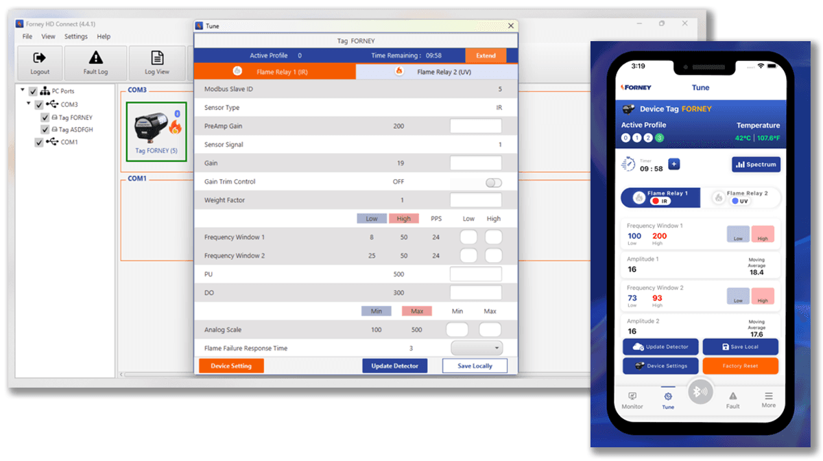
During → Data Visualization
Real‑Time Flame Signals, LED States, and Spectrum Analysis
Technicians needed a mobile‑friendly way to interpret flame signals, LED states, and frequency spectrum data. Desktop tools were too dense and lacked real‑time clarity.
Real‑Time Flame Signals, LED States, and Spectrum Analysis
Technicians needed a mobile‑friendly way to interpret flame signals, LED states, and frequency spectrum data. Desktop tools were dense, slow, and hard to scan in field conditions.
Real‑Time Flame Signals, LED States, and Spectrum Analysis
Technicians needed a mobile‑friendly way to interpret flame signals, LED states, and frequency spectrum data. Desktop tools were dense, slow, and hard to scan in field conditions.


What was found
No mobile representation of LED behavior
Flame signal data difficult to interpret on small screens
Spectrum analysis buried in desktop tools
Field users needed fast, glanceable status cues
What was found
No mobile representation of LED behavior
Flame signal data hard to interpret on small screens
Spectrum analysis buried in desktop tools
Field users needed fast, glanceable status cues
What was found
No mobile representation of LED behavior
Flame signal data difficult to interpret on small screens
Spectrum analysis buried in desktop tools
Field users needed fast, glanceable status cues
What was designed
On‑screen LED indicators mirroring hardware behavior
A mobile‑optimized flame frequency spectrum chart
Clear iconography and color coding for rapid scanning
Layouts structured for field visibility and low‑light condition
What was designed
• On‑screen LED indicators mirroring hardware behavior
• Mobile‑optimized flame frequency spectrum chart
• Iconography for signal status, gain, and temperature thresholds
• Semantic color for temperature, alerts, and diagnostic states
• Layouts structured for field visibility and low‑light condition
What was designed
On‑screen LED indicators mirroring hardware behavior
A mobile‑optimized flame frequency spectrum chart
Clear iconography and color coding for rapid scanning
Layouts structured for field visibility and low‑light condition
Why it mattered
Technicians rely on LED logic for real‑time decisions
Visual parity reduced misreads in the field
Clear iconography accelerated diagnostics
Semantic color improved scan clarity and reduced support calls
Real‑time visuals built trust between hardware and UI
Why it mattered
Technicians rely on LED logic for real‑time decisions
Visual parity reduced misinterpretation in the field
Mobile charts accelerated diagnostics
Clear visuals improved confidence and reduced support calls
Why it mattered
• Technicians rely on LED logic for real‑time decisions
• Visual parity reduced misreads in the field
• Clear iconography accelerated diagnostics
• Semantic color improved scan clarity and reduced support calls
• Real‑time visuals built trust between hardware and UI
Impact (After)
Delivered mobile‑ready visualizations that mirrored hardware behavior and enabled instant interpretation in real‑world conditions.
Impact (After)
Delivered mobile‑ready visualizations that mirrored hardware behavior and enabled instant interpretation in real‑world conditions.
Impact (After)
Delivered mobile‑ready visualizations that mirrored hardware behavior and enabled instant interpretation in real‑world conditions.
During → Pivoting the System: Accessible, Field‑Ready Color Model
The existing brand palette wasn’t designed for digital products or field conditions. Orange dominated the identity, but its saturation typically signals warnings in technician workflows.

What Was Found
No hierarchy for status or diagnostic states
Orange overused as a primary UI color
Limited palette for low‑light environments
Brand colors not optimized for mobile screens
What was found
No hierarchy for status or diagnostic states
Orange overused as a primary UI color
Limited palette for low‑light environments
Brand colors not optimized for mobile screens
What Was Designed
• Expanded palette for clear, usable UI
• Added status colors for alerts and gain
• Tinted orange for non‑warning use
• Defined colors for charts, LEDs, plots
• Built for low‑light, field usability
What was designed
• Expanded palette for clear, usable UI
• Added status colors for alerts and gain
• Tinted orange for non‑warning use
• Defined colors for charts, LEDs, plots
• Built for low‑light, field usability
Why It Mattered
Technicians rely on color for fast interpretation
Clear hierarchy reduces misreads in high‑pressure environments
Accessible colors improve visibility in low‑light conditions
Why it mattered
Technicians rely on color for fast interpretation
Clear hierarchy reduces misreads in high‑pressure environments
Accessible colors improve visibility in low‑light conditions
Impact (After)
A scalable, accessible color system that reinforced brand identity while supporting real‑time diagnostics.
Impact (After)
A scalable, accessible color system that reinforced brand identity while supporting real‑time diagnostics.
Impact (After)
A scalable, accessible color system that reinforced brand identity while supporting real‑time diagnostics.
During → Unified Layout Strategy
Before high‑fidelity design, early wireframes visualized interaction logic, surfaced edge cases, and aligned the remote engineering team around mobile behavior.
Before high‑fidelity design, early wireframes visualized interaction logic, surfaced edge cases, and aligned the remote engineering team around mobile behavior.
Before high‑fidelity design, early wireframes visualized interaction logic, surfaced edge cases, and aligned the remote engineering team around mobile behavior.

What was found
Diagnostic steps needed restructuring
Desktop logic didn’t translate cleanly to mobile
Alerts and states required clearer hierarchy
Team needed visual clarity to validate assumptions
What was found
Diagnostic steps needed restructuring
Desktop logic didn’t translate cleanly to mobile
Alerts and states required clearer hierarchy
Team needed visual clarity to validate assumptions
What was designed
• Low‑fidelity sketches mapping technician tasks
• Annotated flows showing alerts, states, and transitions
• Mobile‑first layouts emphasizing scan clarity
• Early concepts for pairing, monitoring, and diagnostics
What We Designed
• Low‑fidelity sketches mapping technician tasks
• Annotated flows showing alerts, states, and transitions
• Mobile‑first layouts emphasizing scan clarity
• Early concepts for pairing, monitoring, and diagnostics
Why it mattered
• Wireframes reduced ambiguity early
• Provided a shared reference for engineering
• Exposed workflow gaps before high‑fidelity work
• Accelerated alignment across a remote team
Why it mattered
• Wireframes reduced ambiguity early
• Provided a shared reference for engineering
• Exposed workflow gaps before high‑fidelity work
• Accelerated alignment across a remote team
Impact (After)
A validated foundation for mobile workflows that mirrored real technician behavior and reduced cognitive load.
Impact (After)
A validated foundation for mobile workflows that mirrored real technician behavior and reduced cognitive load.
Impact (After)
A validated foundation for mobile workflows that mirrored real technician behavior and reduced cognitive load.
During → Building Trust with a Remote, UX‑New Engineering Team
The engineering team had never collaborated with a UX designer, creating uncertainty around feedback, version control, and design intent.
The engineering team had never collaborated with a UX designer, creating uncertainty around feedback, version control, and design intent.
The engineering team had never collaborated with a UX designer, creating uncertainty around feedback, version control, and design intent.


What was found
Feedback scattered across channels
No existing UX review process
Limited visibility into design status
Team unsure how to evaluate UI decisions
What was designed
Used Figma comments for contextual, element‑level feedback
Organized pages to show status, versions, and evolution
Guided the team on how to review and respond effectively
Why it mattered
Reduced rework by aligning early and often
Improved clarity across a distributed team
Built confidence in structured design governance
Enabled faster iteration with fewer misunderstandings
Why it mattered
Reduced rework by aligning early and often
Improved clarity across a distributed team
Built confidence in structured design governance
Enabled faster iteration with fewer misunderstandings
Impact (After)
Enabled effective collaboration through clear feedback systems, transparent versioning, and predictable review cycles.
Impact (After)
Enabled effective collaboration through clear feedback systems, transparent versioning, and predictable review cycles.
Impact (After)
Enabled effective collaboration through clear feedback systems, transparent versioning, and predictable review cycles.
Technicians needed a clear way to evaluate flame sensor behavior before development. Static documentation and desktop tools made it difficult to visualize real‑time interactions, slowing alignment across engineering, product, and field teams.
What Was Found
• Hard to visualize LED logic from documentation
• No way to simulate device states or settings
• Stakeholders struggled to interpret diagnostic flows
• Requirements unclear without interactive context
What Was Designed
Clickable prototypes simulating connected devices
Interactive flows for pairing, monitoring, and diagnostics
LED state simulations mirroring hardware behavior
Mobile‑first layouts for real‑time evaluation
Why It Mattered
Enabled early validation of diagnostic workflows
Reduced ambiguity around device behavior
Improved stakeholder confidence in the subscription model
Surfaced edge cases before engineering investment
Outcome → Delivered interactive prototypes that aligned stakeholders early, clarified requirements, and accelerated the path to development by visualizing real‑time sensor interactions in a mobile context.
DURING → Simulating Device Behavior Before Development
Technicians needed a clear way to evaluate flame sensor behavior before development. Static documentation and desktop tools made it difficult to visualize real‑time interactions, slowing alignment across engineering, product, and field teams.
What it mattered
Enabled early validation of diagnostic workflows
Reduced ambiguity around device behavior
Improved stakeholder confidence in the subscription model
Surfaced edge cases before engineering investment
What was designed
Clickable prototypes simulating connected devices
Interactive flows for pairing, monitoring, and diagnostics
LED state simulations mirroring hardware behavior
Mobile‑first layouts for real‑time evaluation
What was found
Hard to visualize LED logic from documentation
No way to simulate device states or settings
Stakeholders struggled to interpret diagnostic flows
Requirements unclear without interactive context
Outcome →Delivered interactive prototypes that aligned stakeholders early, clarified requirements, and accelerated the path to development by visualizing real‑time sensor interactions in a mobile context.
DURING → Simulating Device Behavior Before Development
During → Simulating Device Behavior Before Development
Technicians needed a clear way to evaluate flame sensor behavior before development. Static documentation made it difficult to visualize real‑time interactions.
What was found
• Hard to visualize LED logic from documentation
• No way to simulate device states or settings
• Stakeholders struggled to interpret diagnostic flows
• Requirements unclear without interactive context
What was designed
Clickable prototypes simulating connected devices
Interactive flows for pairing, monitoring, and diagnostics
LED state simulations mirroring hardware behavior
Mobile‑first layouts for real‑time evaluation
Why it mattered
Enabled early validation of diagnostic workflows
Reduced ambiguity around device behavior
Improved stakeholder confidence in the subscription model
Surfaced edge cases before engineering investment
Impact (After)
Delivered interactive prototypes that aligned stakeholders early and accelerated development by visualizing real‑time sensor interactions.
After → Final Screens & Impact
These screens represent the iScan3+ mobile experience across core technician workflows. The final UI brings real‑time diagnostics, LED parity, and field‑ready interaction models into a single, mobile‑first system that mirrors how technicians work on‑site.
These screens represent the iScan3+ mobile experience across core technician workflows. The final UI brings real‑time diagnostics, LED parity, and field‑ready interaction models into a single, mobile‑first system that mirrors how technicians work on‑site.
These screens represent the iScan3+ mobile experience across core technician workflows. The final UI brings real‑time diagnostics, LED parity, and field‑ready interaction models into a single, mobile‑first system that mirrors how technicians work on‑site.


What the screens demonstrate
Real‑time device pairing and status visibility
LED logic mirrored directly from hardware
Mobile‑optimized flame signal and spectrum charts
Clear hierarchy for alerts, gain, and diagnostic states
Plant‑level organization for multi‑device environments
Outcome What The Screens Demonstrate
LED logic mirrored directly from hardware
Real‑time device pairing and status visibility
Mobile‑optimized flame signal and spectrum charts
Clear hierarchy for alerts, gain, and diagnostic states
Plant‑level organization for multi‑device environments
Why it mattered
Diagnostic steps are faster and easier to interpret
Technicians get instant clarity in the field
Color and iconography reduce misreads under pressure
Mobile workflows align with real‑world technician behavior
Cross‑platform consistency supports a single codebase
Why it Mattered
Diagnostic steps are faster and easier to interpret
Technicians get instant clarity in the field
Color and iconography reduce misreads under pressure
Mobile workflows align with real‑world technician behavior
Cross‑platform consistency supports a single codebase
Impact (After)
A cohesive, technician‑centered mobile experience that supports real‑time diagnostics, reduces cognitive load, and strengthens Chentronics’ competitive position with a modern, IoT‑ready application for both iPhone and Android.
Impact (After)
A cohesive, technician‑centered mobile experience that supports real‑time diagnostics, reduces cognitive load, and strengthens Chentronics’ competitive position with a modern, IoT‑ready application for both iPhone and Android.
Impact (After)
A cohesive, technician‑centered mobile experience that supports real‑time diagnostics, reduces cognitive load, and strengthens Chentronics’ competitive position with a modern, IoT‑ready application for both iPhone and Android.
Note → The app is available for both Android and iPhone.
Note → The app is available for both Android and iPhone.
Note → The app is available for both Android and iPhone.
Other Projects

Gator Design System

Insurance Underwriting
Underwriting
Dashboard

Financial Trading
Financial
Dashboard
Gator Design
System
Underwriting Dashboard
Financial Dashboard
Financial
Dashboard
AI Assistant
Virtual Paul