

EcoStruxure Subscription Complexity Made Legible
EcoStruxure's subscription and activation model had grown too complex to navigate. Feature dependencies were invisible, activation logic differed across territories, and users had no reliable way to see what they owned, what was active, or what was shared.
IoT
Industrial Automation
Service Design
Subscription UX
User Research

THE CONSTRAINT
EcoStruxure's subscription model had outgrown its interface. Activation logic differed by territory, feature dependencies stayed invisible until one broke an activation downstream, and no single screen or team owned the full picture.
The system grouped subscriptions by its own activation logic. The people using it did not think that way. That gap, not the surface design, was the real problem.
WHAT I DID
Mapping the activation model came first: more than ten activation states, traced with engineering against the SmartConnector logic so the design described real behavior, not assumed behavior. Card-sort research then tested whether users grouped subscriptions the way the technical model did. They did not, so the interface was built around their language, with status, expiration, and utilization legible at a glance and dependencies surfaced before an activation could break something downstream.
RESEARCH
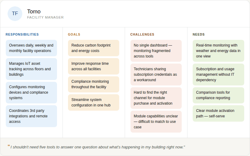
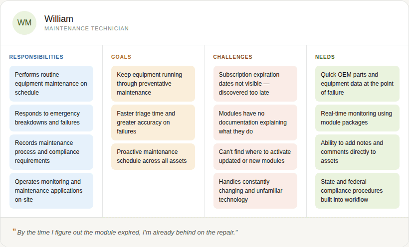
Two users, two different mental models
Card-sort sessions surfaced the gap between how the system modeled subscriptions and how users actually thought about them. Two roles drove the design, and neither grouped subscriptions the way the activation logic did.
Field Inquiry Step
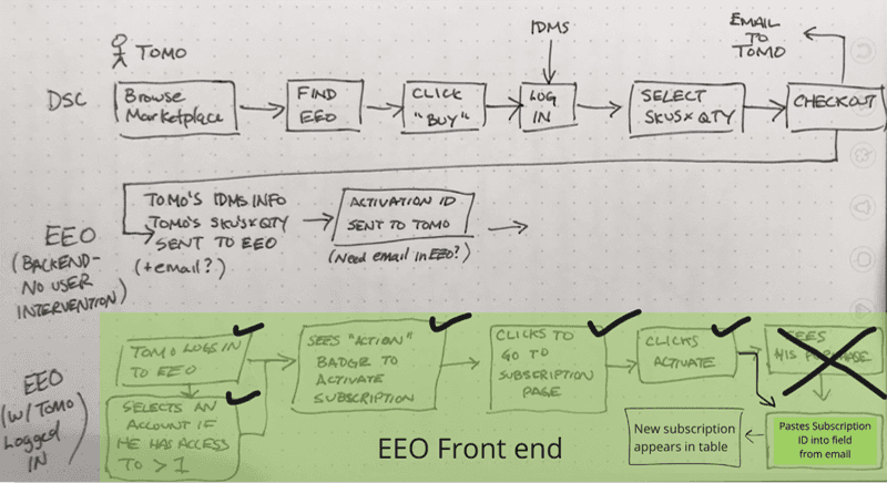
KEY FINDINGS
Customers had to manually copy a Subscription ID from an email into a field inside EEO. No customer discovered this on their own every participant required explicit guidance to complete the step.
Module Awareness Process Map
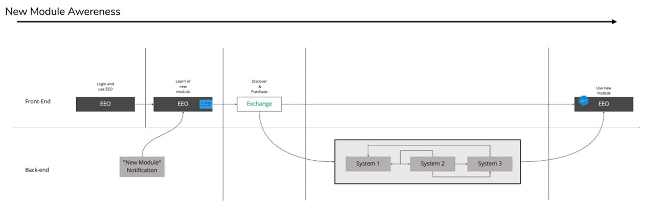
KEY FINDINGS
Module awareness. A "New Module" notification arrived with no clear path to act on it. Discovery and purchase sat in separate systems with no flow connecting them.
Service Blueprint
KEY FINDINGS
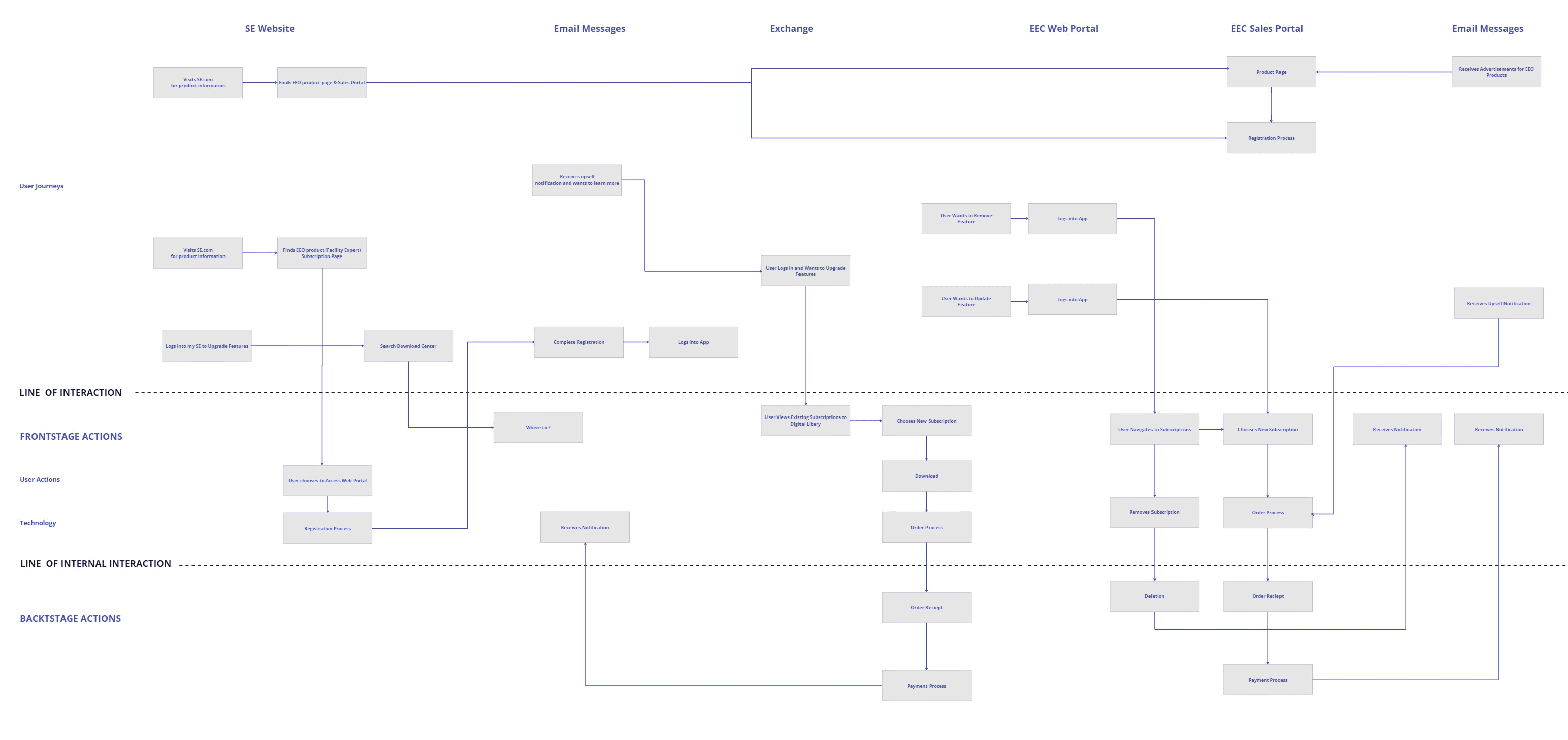
No single touchpoint owned the full activation experience. Users were expected to navigate between the SE website, email, and EEO with no handoff guidance between any of them.
Account Activation Flow
KEY FINDINGS
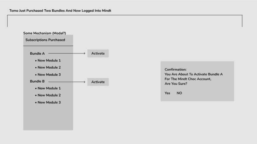
Even the simplest activation scenario, one user, one account, two bundles, required a confirmation step that no customer knew to expect. The mechanism (modal vs inline) was still an open question during research.
Multi Account Activation Flow
KEY FINDINGS
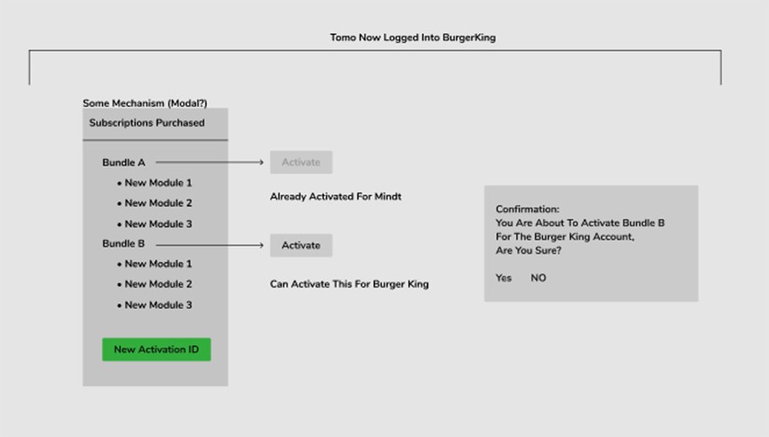
Customers managing multiple accounts had no way to see which bundles were already activated, for which account, or whether a new activation was possible. Every multi-account customer encountered this as a failure, not a feature.
THE WORK
Four iterations. Each one shaped by research.
Decisions went to product and engineering at every stage, traceable rather than assumed.
Iteration: Module Management & Discovery

Research-influenced change. Customers in other Schneider apps were unaware of their module capabilities, so module status, newly released badges, and a path to the Exchange Shop were built into the card, with suggested modules surfaced from historical use.
Iteration: Subscription Status

Research-influenced change. Users had no single place to read subscription and invoice status, so plan, type, and renewal date were pulled into one sortable list they never had to leave.
Iteration: Subscriptions & Module Details
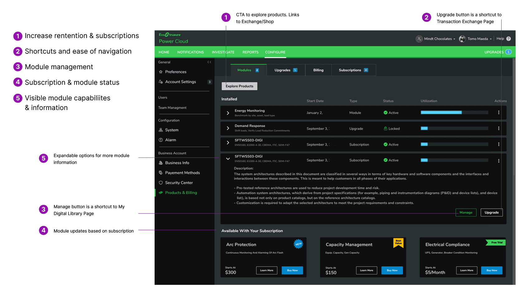

Research-influenced change. The external handoff broke every upgrade, so available modules were shown with price and a direct buy path at the point of decision, inside the workflow.
Iteration: Final Module List With Iconography Color Coding

Research-influenced change. Expiration was being discovered too late, so color-coded status across the module list made active, expiring, and available states read at a glance.
OUTCOMES
A legible subscription management experience, built on a fully mapped activation model and validated against real user needs.

Full activation model documented
The first complete map of EcoStruxure's subscription logic, shared across design, product, and engineering as a single source of truth. Decisions that previously required back-and-forth with engineering could be made directly from the model.

Clear subscription visibility interface
Users could see what they owned, what was active, and what was shared without needing to understand the underlying .NET activation logic. Subscription confusion eliminated at the point of interaction, reducing support burden and renewal friction.


Expiration surfaced before failure
Subscription expiration dates and "Expires Soon" warning states are visible in context, at the point where users manage modules, not discovered after access is already lost. Technicians see what's expiring, when, and can act before it affects the job.
WHAT I'D DO DIFFERENTLY
Run card-sort interviews before completing the activation logic map. Mapping the technical model first was necessary for credibility, but the research revealed users had different mental models for concepts I'd already designed around. Running both in parallel would have let user language shape the map from the start.