

THE PROBLEM


THE PROBLEM
Stories weren't getting met. The team was building the same things twice, three ways.
The team wasn't building the wrong things. They were building the right things without a common language, and the cost was showing up in every sprint.
UX DEBT SPIRAL — HOW AD-HOC STYLING DECISIONS COMPOUND ACROSS THREE FRAMEWORKS

MY ROLE
Led UX design for Gator DS — from UI audit and token architecture through component documentation and .NET Blazor handoff.
WHAT I OWNED
I established Gator from the ground up — audit, token architecture, atomic structure, component documentation, and rollout. I worked with the PM and dev leads throughout, but the system definition, design decisions, and socialization plan were mine.
HOW I WORKED
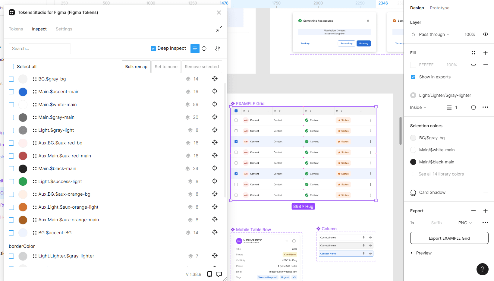
Navigator runs on .NET Blazor. Every component spec was written with Blazor's rendering model in mind — parameter bindings, state behavior, responsive rules. Tokens Studio bridged Figma to the GitHub token file directly. Specs were implementation-ready before stories entered the sprint.
THE CONSTRAINT
Gator had to be built fast enough to be useful before Navigator feature work outpaced it. That shaped every sequencing decision — atoms before molecules, documentation running parallel to builds, not after.
DISCOVERY
Before any components, I ran a full UI audit.
What I found wasn't surprising — it just hadn't been documented. Inconsistent spacing. Typography that drifted across modules. Components that looked related but weren't built from the same rules. The audit gave the team a concrete starting point: here's what exists, here's what conflicts, here's what needs a decision.

PROCESS
From UI audit to .NET Blazor handoff.
Discovery & UI Audit
Full inventory of live components. Documented inconsistencies across spacing, typography, color, and navigation. Established the baseline before any system decisions were made.
System Definition
Defined what Gator would govern — atoms, molecules, organisms, and layouts — and established scope boundaries with the PM and dev leads before component work began.
Atomic Foundation
Color palette validated to WCAG AA via Level Access. Typography, spacing, and icon set standardized. Token taxonomy established and imported via Tokens Studio from the existing GitHub file.
Component Build — Molecules & Organisms
Molecules defined from atoms. Organisms from molecules. Nothing composed until the foundation held. Full state matrices built for every component variant.
Documentation & Socialization
Working sessions run with dev leads and the PM. Component usage rules written at the story level. Acceptance criteria referenced Gator components directly so QA had a testable standard, not an interpretation.
.NET Blazor Handoff
Every spec written for Blazor's rendering model — parameter bindings, state definitions, responsive behavior. Implementation-ready before stories entered the sprint.
DESIGN DECISIONS
Every decision traced back to something that wasn't working.
Four distinct choices — each one a direct response to a specific problem in the build.
DECISION 1
Token Studio — one file, one conversion.

ATOMIC FOUNDATION — TOKENS, TOGGLES, CHECKBOXES, AND ICONS AS THE BASE LAYER OF THE SYSTEM
FINDING
The token library already existed as a single file in GitHub. Getting it into Figma without rebuilding it by hand would have introduced errors and taken time the project didn't have.
INSIGHT
The tool choice wasn't about preference. Token Studio could ingest that GitHub file directly and convert it in one shot. No manual re-entry. No drift between the source file and what Figma saw.
DESIGN
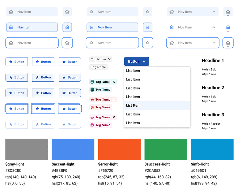
Tokens imported from GitHub via Tokens Studio. Named taxonomy established: $namespace.$token-name $gray-light, $accent-main, $aux-red-main. Every color, spacing value, and typography decision centralized and referenced the same way across every component.
DECISION 2
Button state completeness — every state, every variant.

Full button state matrix — primary, secondary, tertiary across all five interaction states
FINDING
Buttons in the existing UI had inconsistent hover, focus, and disabled states across modules. Developers were interpolating — guessing what the state should look like based on what they'd seen elsewhere.
INSIGHT
A CRM used every day by sales reps isn't a marketing site. Every state gets hit, multiple times per session. A missing focused state isn't a design detail — it's an accessibility gap and a QA failure waiting to happen.
DESIGN
Full state matrix built for every button variant: primary, secondary, tertiary. Normal, hover, selected, focused, disabled — all specified, all documented. Blue and red color variants fully mapped. No interpolation required. Developers had an answer for every state before a single story entered the sprint.
DECISION 3
Atoms first — nothing composed until the foundation held.

Atomic progression — atoms defined and locked before molecules, organisms, or layouts were built
FINDING
The team was building organisms before atoms were settled. Components looked similar but weren't built from the same rules. Every new feature added new drift.
INSIGHT
You can't govern a molecule if the atoms it's made from aren't agreed on. Starting at the atomic level — type, color, spacing, icons — before touching any composed component meant every molecule and organism that came after inherited consistent decisions rather than overriding them.
DESIGN
Atoms defined and locked first: WCAG AA-validated color palette via Level Access Color Contrast Checker, typography scale (Mulish Bold/Regular, documented sizes), spacing tokens, Font Awesome icon set standardized across frameworks. Molecules built from atoms. Organisms built from molecules. Nothing composed until the foundation held.
DECISION 4
Socializing the system — not just shipping it.
Component documentation written at the story level — usage rules, not just specs
FINDING
A design system that only the designer knows exists isn't a system — it's a Figma file. The team needed to understand what Gator governed and how to use it before Navigator work began.
INSIGHT
Documentation alone doesn't drive adoption. Working sessions do. Developers need to see the system solve a problem they actually have — not read about how it theoretically should.
DESIGN
Working sessions run with dev leads and the PM. Component usage rules documented at the story level — not just in Figma. Acceptance criteria written to reference Gator components directly, so QA had a testable standard, not an interpretation.
OUTCOMES
A governed, consistent component library — delivered before Navigator shipped.
Gator shipped before Navigator did. Every UI pattern in Navigator drew from it.

PROJECT GALLERY
From fragmented codebases to one shared design foundation


Components
Components
Token Settings


Page Components
Page Templates
Color System
What I'd do differently
Documentation chased the build instead of leading it. Components were ready before the usage rules were written — which meant developers had the pieces but not always the guidance for which variant to use when. Running documentation in tighter parallel with component builds would have reduced those mid-sprint questions.
Scope boundaries weren't fully agreed on early enough. When new feature requests came in that didn't map cleanly to existing Gator patterns, there was friction — because nobody had formally defined what the system would and wouldn't govern. A scope agreement at the start of the engagement would have made those conversations easier.