

THE PROBLEM

THE PROBLEM
FINRA's DXT initiative was stalling — not because investigators lacked tools, but because every team was using different ones.
Six tools. Twelve teams. No single source of truth for active case status. Investigators weren't the problem. The organizational structure was.
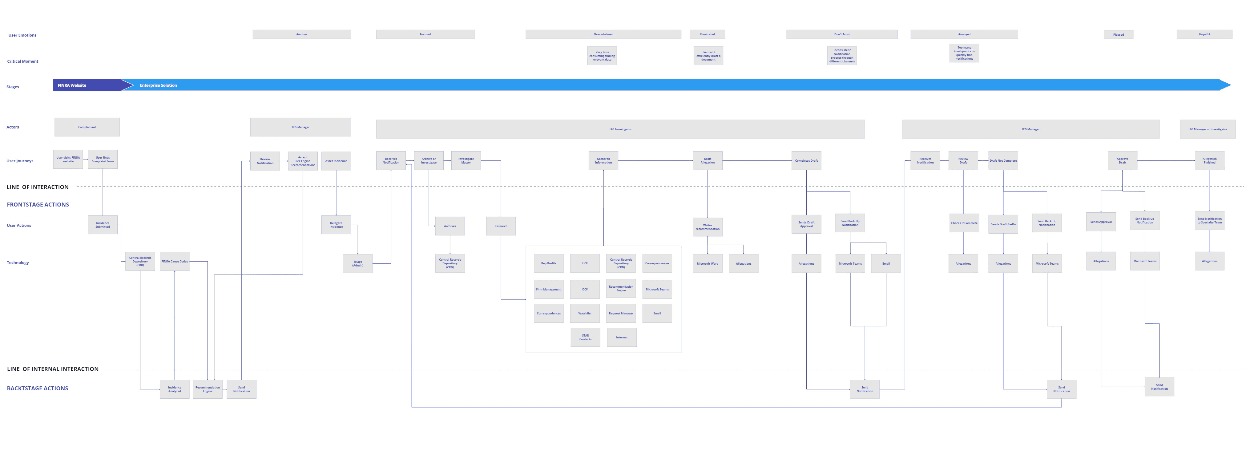
Seven incident types. Six national cause teams. Twenty-five thousand matters received per year. Every team tracking the same cases in different systems, with no shared language for status, priority, or ownership. The matter sequence diagram wasn't hypothetical — it was the actual flow investigators were navigating across six disconnected platforms every day.

MATTER SEQUENCE — 7 INCIDENT TYPES ACROSS 6 NATIONAL CAUSE TEAMS, NO SHARED SOURCE OF TRUTH
MY ROLE
Led UX design for FINRA's Financial Crimes Investigation Dashboard — from contextual inquiry and cross-team workflow mapping through widget architecture and prototype validation.
WHAT I OWNED
I ran all 10+ investigator interviews independently across twelve teams. I built the matter sequence map and the service blueprint before any UI work began — neither was scoped, both became the foundation the design was built on. I facilitated the cross-team impact/effort prioritization session in Miro. I designed the lo-fi prototype and ran the first-ever self-guided validation session at FINRA. Full UX scope from contextual inquiry through widget architecture specs and interaction fidelity prototyping.
HOW I WORKED
Designed for FINRA Gateway — a widget-centric platform built on AWS cloud-native architecture with an Angular frontend and .NET microservices backend. Components built as modular, interchangeable widgets consumable across the full platform. Every component spec written with FINRA's widget governance model in mind. Worked closely with the Lead Product Manager for DXT throughout the engagement — research findings drove feature prioritization, widget hierarchy, and information density decisions directly.
THE JUDGMENT CALL
The DXT initiative had a stated direction before research was complete. Contextual inquiry revealed the real problem was structural, not technical — which reframed the entire design brief mid-engagement. The unified dashboard wasn't the starting assumption. It was where the evidence pointed.
THE CORE TENSION
The investigators didn't need faster tools. They needed one place where every team could see the same thing at the same time.
The DXT initiative was focused on speed — but the real blocker was visibility. Status lived in different systems depending on which team you asked. Once that root cause was clear, the design direction followed directly.
RESEARCH & DISCOVERY
What investigators actually told us.
Contextual inquiry across twelve investigation teams made the problem clear. Six siloed platforms, no shared case visibility, investigators manually copying case IDs between systems just to do their job. The DXT initiative was focused on speed. Research revealed the real blocker was structure.

Impact/effort prioritization matrix — cross-team stakeholder session across all 12 investigation teams
Before any wireframes I ran a cross-team prioritization session with investigators and stakeholders from all twelve teams. "Tools in one location within the workspace" scored 90% — that single number drove the unified workspace decision before a single screen was drawn.
Service Blueprint — cross-team investigation flow across actors, systems, and touchpoints

Requested features — cross-team stakeholder inquiry across 12 investigation teams. "Tools in one location" scored 90%.
Ten features ranked by cross-team priority. Tools in one location scored 90% — the highest agreement across all twelve teams. That number ended the debate about whether a unified workspace was the right direction.
STAKEHOLDER INQUIRY
Four things came up in every conversation.
DESIGN DECISIONS
Every decision traced back to a finding.
DECISION 1
Unified investigation workspace — replacing six siloed tools with one shared platform.

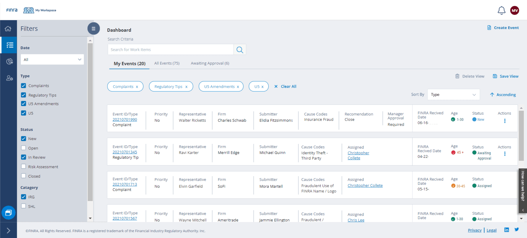
My Workspace Dashboard — all matter types, teams, and case status in a single view
FINDING
Investigators were manually transferring data across six disconnected systems to build a single case record. No shared view existed across the twelve investigation teams.
INSIGHT
The silos weren't accidental — they were encoded in the technology. Every tool had been chosen by a team for a team. The fix had to be organizational, not just technical.
DESIGN
DXT — a single Angular/.NET modular platform replacing all six tools. Every team, every case, every workflow in one shared environment. Built on AWS cloud-native architecture for scale.
DECISION 2
Modular by design — customizable to the investigator, governed by the organization.

Modular workspace view — investigator and manager roles surfaced through configurable dashboard controls
FINDING
Twelve teams had built twelve workflows. A single rigid interface would have replaced one problem with another — forcing investigators into a process that didn't match how they actually worked.
INSIGHT
The platform needed to be flexible at the investigator level and governed at the organization level. Role-based modularity was the only architecture that could serve both simultaneously.
DESIGN
Angular/.NET modular widget system — investigators customize their workspace view. Organization-level governance controls what data surfaces where. Validated through fast prototype sessions before any production build.
Modular by design, customizable by investigator
DECISION 3
Lo-fi prototype shared directly with investigators the first time this feedback process had ever been run at FINRA.
Early navigation wireframe — self-guided prototype with filter panel and assignment flow
FINDING
Investigators had never reviewed a prototype and given direct feedback before. Getting real, unfiltered input on the workflow design required introducing a new process — not just a new interface.
INSIGHT
If investigators had to be guided through the prototype, the feedback would be about the guidance not the design. The prototype had to work without a facilitator in the room.
DESIGN
Intentionally lo-fi. Pink indicators marked functioning interactions so investigators could explore independently and give unfiltered feedback on their own time. First-ever self-guided validation session at FINRA. What came back directly influenced the final design.
DECISION 4
Every priority linked to an investigator — accountability built into the data model.

Designed matter cards — priority, investigator, and case status surfaced at a glance
FINDING
Without shared visibility, case priorities were invisible across teams. Managers had no way to see workload distribution. Investigators had no way to flag urgency that others would see.
INSIGHT
Priority is only meaningful if it's visible to the right people at the right level. Linking every priority to a named investigator made accountability explicit without requiring manual reporting.
DESIGN
Every case priority surfaces with the assigned investigator. Manager view shows active cases, workload, and priority distribution across all twelve teams in real time — no separate reporting layer required.
DECISION 5
Matter sequence and service blueprint — mapping the full investigation flow before designing any screen.
End-to-end investigation flow — full service blueprint mapped across all twelve teams before UI work began
FINDING
No one had ever mapped the end-to-end investigation process across all twelve teams. Each team knew its own workflow. Nobody had the full picture. The platform couldn't be designed without it.
INSIGHT
A service blueprint wasn't just a research artifact — it was the foundation the entire design had to be built on. Without it, any screen designed would be optimizing one team's workflow at the expense of another's.
DESIGN
Matter sequence map and end-to-end service blueprint delivered before any UI work. The full investigation flow — from complaint intake to resolution — documented across all teams and used as the design foundation throughout the project. Neither artifact was scoped. I built both because the design couldn't proceed without a shared picture of the full flow. Both were shared with the team and became the foundation every subsequent decision was built on.

Complaint investigation process — disposition flow mapped as part of the service blueprint work

U5 disposition flow — one of eight workflows mapped before any screen was designed
OUTCOMES
A unified investigative workspace — six tools replaced, twelve teams aligned, one shared source of truth.
Consolidated 6+ investigative tools
into a single, configurable workspace — eliminating the context switching that slowed investigator decision-making.
Widget-based architecture adopted
modular components that investigators could configure around their specific workflow needs. The design patterns established for the investigation dashboard became the standard for the full platform.
Faster alert triage and case review
structured risk indicators and progressive disclosure replaced manual cross-referencing across six tools. Investigators could act on a case from a single view for the first time.
Single shared source of truth
for the first time every investigative team seeing the same case status in the same place, ending the coordination failures that slowed resolution.
PROJECT GALLERY
From investigation flow mapping to unified case workspace


Card Hierarchy 01
Card Hierarchy 02
Card Hierarchy 03


Complaint
Admin View
U5 Disposition


Batch Selection — Multi-Case Assignment Workflow
Final Dashboard — Investigator
Manager View — Active Cases & Team Assignment
What I'd do differently
Start widget governance conversations with engineering earlier. The modular architecture worked well, but some widget interaction patterns — particularly cross-widget data sharing and state persistence — weren't fully defined until mid-build. A joint design-engineering session on widget communication contracts at the start of the project would have prevented the rework that came later. When the component architecture is this central to the product, the technical model and the design model need to be designed together from day one.