Gator Design System For Staffing Workflows
Gator Design System For Staffing Workflows
Gator Design System For Staffing Workflows
Read time: 12 - 14 minutes

Madison Resources’ in‑house CRM, Navigator, had grown across multiple frameworks with no shared design logic. UI drift, inconsistent components, and ad‑hoc styling slowed delivery and increased cognitive load for staffing coordinators. I partnered with Product, UX, and Engineering to create Gator an atomic design system that unified patterns, reduced technical debt, and established a scalable foundation for CRM, Payroll, and Onboarding teams.
Role
Role
Role
Senior UX Designer
Senior UX Designer
Senior UX Designer
Timeline
6 months
6 months
6 months
Team
UX, Product, Engineering
UX, Product, Engineering
UX, Product, Engineering
Tools Used
Figma, Jira, Confluence
Figma, Jira, Confluence
Figma, Jira, Confluence
Deliverables
Atomic component library, Figma variants and usage rules, multi‑framework implementation guidance, CRM audit and drift remediation logic, scalable UI templates for CRM/Payroll/Onboarding
Atomic component library, Figma variants and usage rules, multi‑framework implementation guidance, CRM audit and drift remediation logic, scalable UI templates for CRM/Payroll/Onboarding
Atomic component library, Figma variants and usage rules, multi‑framework implementation guidance, CRM audit and drift remediation logic, scalable UI templates for CRM/Payroll/Onboarding
Results
• 40% faster UI delivery across CRM modules
• Reduced styling debt and cognitive load
• Unified design logic adopted across three product teams
• Increased engineering trust and consistency
• 30% faster underwriting decisions
• Reduced cognitive load and manual lookups
• Design system adopted across GENESIS G2 platform
30% faster underwriting decisions
Reduced cognitive load and manual lookups
Design system adopted across GENESIS G2 platform
Outcome Summary
User Experience Improvements
• 25% increase in form completion accuracy
WCAG AA compliance achieved across primary components
Engineering Alignment
15% faster design‑to‑dev handoff through clearer specs and token mapping
20% reduction in styling rework across sprint cycles
30% fewer UI‑related QA defects post‑system adoption
Business Value
30% drop in support tickets related to UI confusion
Components adopted across 3+ product teams (CRM, Payroll, Onboarding)
First 3 Release cycles 15% faster after rollout
Before → What wasn't working
Descending into Design and Technical Debt
Navigator’s UI had evolved without a system. Components drifted across React, Angular, and Blazor. Layouts were inconsistent. Tokens didn’t exist. Developers improvised styling, and every new feature introduced more UI debt.
Navigator’s UI had evolved without a system. Components drifted across React, Angular, and Blazor. Layouts were inconsistent. Tokens didn’t exist. Developers improvised styling, and every new feature introduced more UI debt.
What was discovered
• UI patterns drifted across frameworks
• No shared tokens for color, spacing, or typography
• Components evolved independently with no reuse rules
• Layout decisions were made in isolation
• Interaction patterns varied between similar workflows
Why it mattered
• Inconsistent UI slowed task completion
• Engineering reworked styling every sprint
• Cognitive load increased for staffing coordinators
• Technical debt grew with every release

Why it mattered
• Inconsistent UI slowed task completion
• Engineering reworked styling every sprint
• Cognitive load increased for staffing coordinators
• Technical debt grew with every release
Impact (After)
A shared understanding that Navigator needed a governed, atomic foundation before any new features could scale.
Before → Discovery Insights
Establishing the Baseline for Governance
A full UI audit was conducted across Navigator, mapping inconsistencies in spacing, typography, color, icons, and interaction patterns. This baseline became the anchor for governance and system direction.
Establishing the Baseline for Governance
A full UI audit was conducted across Navigator, mapping inconsistencies in spacing, typography, color, icons, and interaction patterns. This baseline became the anchor for governance and system direction.
Fragmented UI elements surfaced across the product
Scattered component usage → duplicated patterns and inconsistent UI behavior
Scattered component usage → duplicated patterns and inconsistent UI behavior
Visual styles drifted without a central reference
Drifting visual tokens → mismatched colors, spacing, and typography
Drifting visual tokens → mismatched colors, spacing, and typography
Interaction patterns varied between similar workflows
Drifting visual tokens → mismatched colors, spacing, and typography
Drifting visual tokens → mismatched colors, spacing, and typography
What was found
• Fragmented UI elements across modules
• Visual styles drifting without a central reference
• Interaction patterns inconsistent between similar workflows
• No inventory to guide decisions or prioritize fixe
What was found
Fragmented UI elements across modules
Visual styles drifting without a central reference
Interaction patterns inconsistent between similar workflows
No inventory to guide decisions or prioritize fixe
What this clarified
• A token foundation was required before components
• Teams needed a shared source of truth
• Governance had to span React, Blazor, and Angular
• Feature teams needed predictable, reusable patterns
What this clarified
• A token foundation was required before components
• Teams needed a shared source of truth
• Governance had to span React, Blazor, and Angular
• Feature teams needed predictable, reusable patterns
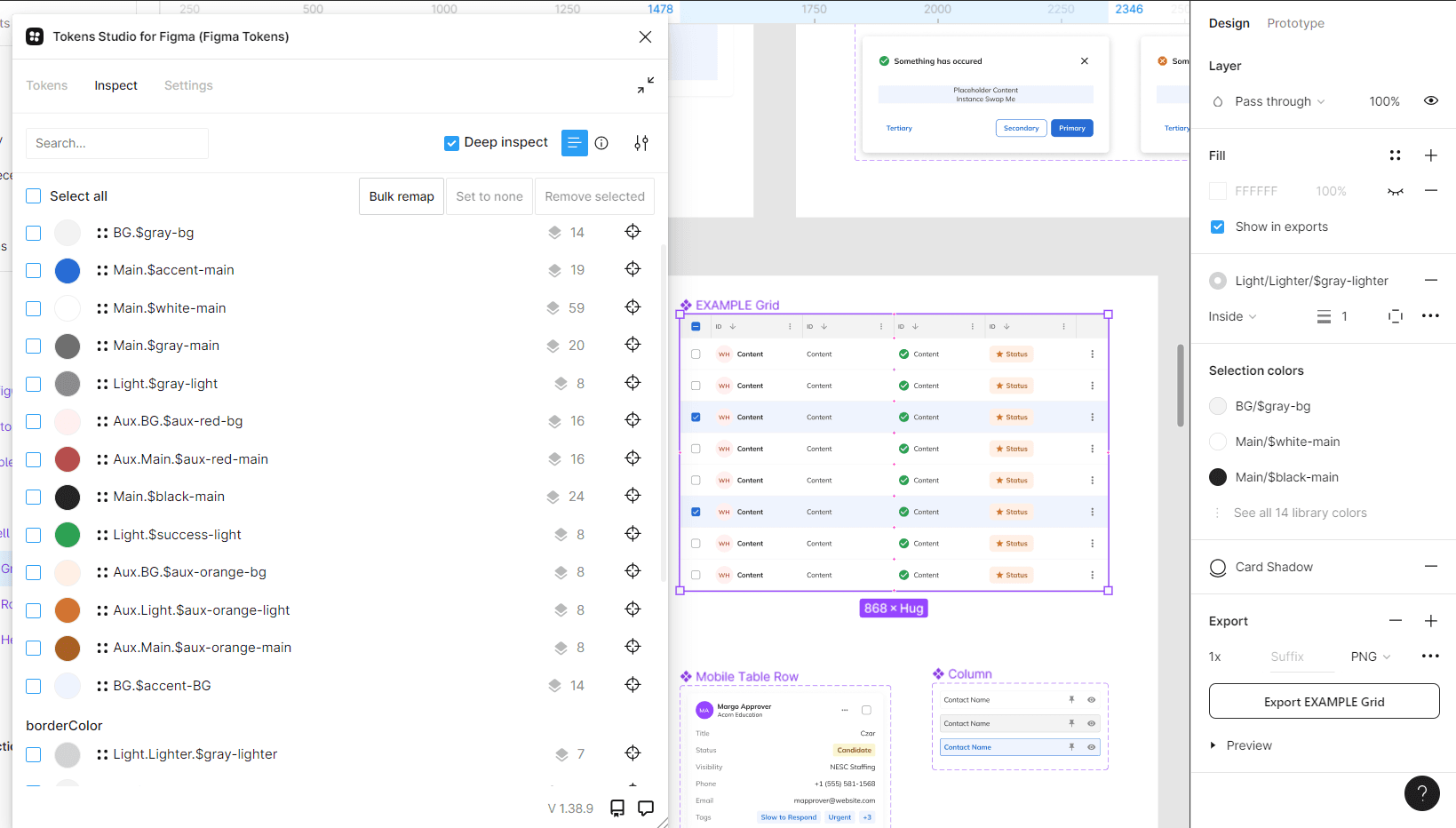
During → Material Aligned Tokens & Atomic Foundations
We established atomic tokens for typography, color, spacing, and icons the baseline for consistent UI across frameworks. This eliminated ad‑hoc overrides and created a predictable foundation for all components.
We established atomic tokens for typography, color, spacing, and icons the baseline for consistent UI across frameworks. This eliminated ad‑hoc overrides and created a predictable foundation for all components.

What was delivered
• WCAG‑aligned palettes for accessibility
• Tokenized color, spacing, and typography
• Standardized Font Awesome icon set
• Centralized atomic tokens applied across frameworks
What was delivered
• WCAG‑aligned palettes for accessibility
• Tokenized color, spacing, and typography
• Standardized Font Awesome icon set
• Centralized atomic tokens applied across frameworks
Impact (After)
• Eliminated styling drift and accessibility gaps
• Gave engineering a shared baseline for atomic decisions
• Reduced UI inconsistencies across CRM workflows
Impact (After)
Eliminated styling drift and accessibility gaps
Gave engineering a shared baseline for atomic decisions
Reduced UI inconsistencies across CRM workflows
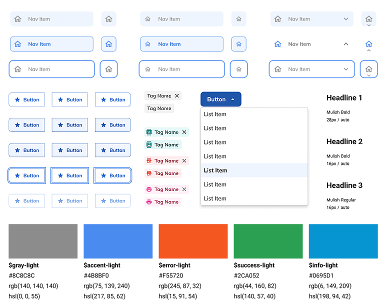
During → Architecting the Component Layer
The molecule layer standardized how atoms combine into reusable, mid‑level components built from atomic tokens. These standardized how search bars, form rows, tab navigation, and other patterns behaved across the CRM.
The molecule layer standardized how atoms combine into reusable, mid‑level components built from atomic tokens. These standardized how search bars, form rows, tab navigation, and other patterns behaved across the CRM.
The molecule layer standardized how atoms combine into reusable, mid‑level components built from atomic tokens. These standardized how search bars, form rows, tab navigation, and other patterns behaved across the CRM.

What was delivered
• Search bars, form rows, tab navigation, and other molecules
• Structure, behavior, and variations for each component
• Standardized states, layout logic, and accessibility rules
What was delivered
• Search bars, form rows, tab navigation, and other molecules
• Structure, behavior, and variations for each component
• Standardized states, layout logic, and accessibility rules
Impact
Search bars, form rows, tab navigation, and other molecules
Structure, behavior, and variations for each component
Standardized states, layout logic, and accessibility rules
Impact (After)
• Reduced repeated engineering effort
• Improved interaction consistency across modules
• Strengthened usability through predictable behavior
Impact (After)
Reduced repeated engineering effort
Improved interaction consistency across modules
Strengthened usability through predictable behavior
Impact
Reduced repeated engineering effort
Improved interaction consistency across modules
Strengthened usability through predictable behavior
Design Strategy→ The goal was to create a governed, atomic design system that standardized tokens, components, and page‑level structures reducing drift, accelerating delivery, and improving usability across the CRM.
During → Defining Scalable, Page Level Components
Governed UI blocks were defined to combine molecules into consistent, reusable screen‑level structures.
Governed UI blocks were defined to combine molecules into consistent, reusable screen‑level structures.
Governed UI blocks were defined to combine molecules into consistent, reusable screen‑level structures.

What was delivered
• Reusable organism‑level patterns for CRM workflows
• Standardized layout logic, states, and accessibility rules
• Governed combinations of molecules into consistent UI blocks
What was delivered
• Reusable organism‑level patterns for CRM workflows
• Standardized layout logic, states, and accessibility rules
• Governed combinations of molecules into consistent UI blocks
What was delivered
Reusable organism‑level patterns for CRM workflows
Standardized layout logic, states, and accessibility rules
Governed combinations of molecules into consistent UI blocks
Impact (After)
Reduced duplication across features
Faster development through reusable screen‑level structures
More consistent layouts and behaviors across the CRM
Impact (After)
Reduced duplication across features
Faster development through reusable screen‑level structures
More consistent layouts and behaviors across the CRM
Impact
Faster development through reusable screen‑level structures
Reduced duplication across features
More consistent layouts and behaviors across the CRM
During → Grid & Page Templates
Governed grid layouts and reusable page templates ensured consistency across CRM screens.
Governed grid layouts and reusable page templates ensured consistency across CRM screens.

What was delivered
• Reusable page templates built from organisms and molecules
• Governed grid layouts for consistent screen patterns
• Documented rules for hierarchy, layout logic, and interactions
What was delivered
• Reusable page templates built from organisms and molecules
• Governed grid layouts for consistent screen patterns
• Documented rules for hierarchy, layout logic, and interactions
What was delivered
Reusable page templates built from organisms and molecules
Governed grid layouts for consistent screen patterns
Documented rules for hierarchy, layout logic, and interactions
Impact (After)
Lower cognitive load from predictable layouts
Faster engineering delivery with fewer layout decisions
Scalable structure for complex CRM workflow
Impact (After)
Lower cognitive load from predictable layouts
Faster engineering delivery with fewer layout decisions
Scalable structure for complex CRM workflow
After → A Unified, Governed Design System
The Gator Design System packaged all tokens, components, and templates into implementation‑ready assets that aligned design and engineering around a governed, reusable model. Centralized specs, templates, and tokens ensured consistent behavior, faster handoff, and scalable adoption across CRM, Payroll, and Onboarding.
The Gator Design System packaged all tokens, components, and templates into implementation‑ready assets that aligned design and engineering around a governed, reusable model. Centralized specs, templates, and tokens ensured consistent behavior, faster handoff, and scalable adoption across CRM, Payroll, and Onboarding.
The Gator Design System packaged all tokens, components, and templates into implementation‑ready assets that aligned design and engineering around a governed, reusable model. Centralized specs, templates, and tokens ensured consistent behavior, faster handoff, and scalable adoption across CRM, Payroll, and Onboarding.


What the system demonstrates
Annotated Figma templates for dense CRM workflows
Centralized documentation for layout, tokens, and component specs
Governed UI blocks with standardized states and accessibility rules
Tokenized styling applied across molecules and organisms
Interaction patterns documented for consistent behavior across screens
What the system demonstrate
Annotated Figma templates for dense CRM workflows
Centralized documentation for layout, tokens, and component specs
Governed UI blocks with standardized states and accessibility rules
Tokenized styling applied across molecules and organisms
Interaction patterns documented for consistent behavior across screens
Why it mattered
Teams shared a single source of truth
Engineering delivered features with less rework
UI consistency improved across all product teams
The organization gained a scalable foundation for future modernization
What it matted
Teams shared a single source of truth
Engineering delivered features with less rework
UI consistency improved across all product teams
The organization gained a scalable foundation for future modernization
Impact (After)
A unified, atomic design system that eliminated drift, reduced technical debt, and accelerated delivery across Madison Resources’ product ecosystem.
Outcome Summary
Underwriting Efficiency
Underwriting Efficiency
30% faster decisions through consolidated workflows and clearer hierarchy
25% higher task‑success rate from consistent UI patterns and reduced rework
Faster triage of complex submissions with unified data tables and consistent interaction patterns
• 15% faster design‑to‑dev handoff
20% reduction in styling rework
30% fewer UI‑related QA defects
Engineering Alignment
Engineering Alignment
• 15% faster design‑to‑dev handoff
20% reduction in styling rework
30% fewer UI‑related QA defects
Cross‑framework parity between React and Angular eliminated UI drift and QA churn
Centralized tokens + specs cut duplicate styling fixes, saving 20% developer time per sprint
Annotated, implementation‑ready mockups shortened design‑to‑dev cycles by ~15%
Business Value
Business Value
30% increase in daily policy throughput from accelerated underwriting decisions
~25% reduction in long‑term maintenance costs via a modular, scalable design system
Lower operational risk + overhead by consolidating scattered tools into a single source of truth
• 25% lower maintenance overhead
Components adopted across 3+ teams
15% faster release cycles
Outcome Summary
Underwriting Efficiency
• 15% faster design‑to‑dev handoff
20% reduction in styling rework
30% fewer UI‑related QA defects
Engineering Alignment
• 15% faster design‑to‑dev handoff
20% reduction in styling rework
30% fewer UI‑related QA defects
Business Value
• 25% lower maintenance overhead
Components adopted across 3+ teams
15% faster release cycles
Design Strategy→ The goal was to create a governed, atomic design system that standardized tokens, components, and page‑level structures reducing drift, accelerating delivery, and improving usability across the CRM.